Cove Communities
Brand Style Guide
Everything you need to use the Cove brand, and nothing you don’t. If you’re looking for a logo, a color, or a font, you’ll find it in under a minute.
This guide is the refreshed Cove brand, and it is the one to work from. The colors and fonts have changed a bit from the original branding, and what you see here is the standard. Any earlier Cove style guide no longer applies. Where something you already have disagrees with this guide, this guide is right.
The rollout is gradual, so you will see old and new side by side for a while. Materials update as they are reordered or replaced. There is no need to throw away usable stock, and no need to worry if your community still has older pieces in service.
Out of your comfort zone? Hand it to us. Anything going to an outside printer, sign shop, or wrap vendor, anything with a budget behind it, and anything a resident or prospect will see that is not built from a template: send it through the Marketing Request Form or email marketingteam@covecommunities.com. We would much rather help early than fix it after it is printed. The full list is in Using the Brand.
Looking for paint colors, furniture, interiors, or approved products and vendors? Those live in the Cove Communities Catalog, a separate companion document currently in development. We’ll link it here as soon as it’s ready.
This guide covers identity, how the brand looks and sounds. The Catalog covers specification and procurement, what to buy, in which finish, from whom.
Brand Foundation
Cove operates communities where people live year-round and resorts where they come to vacation. Premium, but never precious. Everything below flows from that.
Our Mission
To own and operate communities in prime destinations that offer a lifestyle guests and residents love to live.
Our Vision
To create a world where exceptional customer service and generosity are second nature and hospitality is a passion.
Our Values
Hospitality
Lead with “yes,” and go the extra mile.
Excellence
Deliver outstanding experiences.
Passion
Make every moment count.
Trustworthiness
Transparency and integrity.
Stewardship
Protect our people, properties, and resources.
Kindness
Treat others as you’d want to be treated.
Why this sits in a style guide. These aren’t decoration, they’re why the brand looks and sounds the way it does. Warm colors and plain language are hospitality and kindness expressed visually. If a piece of work feels cold or corporate, it’s usually drifted from one of these.
Why Consistency Matters
Everything we make says something about us before anyone reads a word. When our signs, flyers, and emails all look like they came from the same place, people read that as a company that has its act together. That builds trust.
When our materials all look different, we give that away. Not all at once. A little at a time.
There are reasons behind the choices here. Type is sized and color pairs are checked so they stay readable for someone whose eyesight is not what it used to be. That describes a lot of our residents, and it is why those pairings are set the way they are.
The fonts, the colors, and the spacing are already settled, which leaves you the part only you can do: what you are trying to say, for your event, your community, your guests, your residents.
Positioning
Draft, to confirm with Marketing. Cove sits in the space between a campground and a resort: outdoor lifestyle communities with genuine amenities, aimed at people who want an active, sociable life outdoors without the price or formality of a traditional resort. Premium but accessible is the balance to hold, aspirational enough to be desirable, grounded enough to feel like home.
The portfolio spans manufactured-housing communities (long-term residents, largely 55+) and RV parks and resorts (seasonal and short-stay). Both share the brand; the tone shifts slightly, which is covered in Brand Voice.
Cut from the Previous Guide
Long mission and vision essays, org history, and persona documents. None of it changed how anything got designed.
Brand Voice
How Cove sounds: conversational, welcoming, optimistic, and genuine. Community is the product, with a focus on positive aging and active living, so we write about the lifestyle, not the real estate.
Four Things Our Writing Always Is
Warm and Welcoming
We write like a neighbor, not a notice board.
Active and Lifestyle-Focused
We talk about doing things, not owning things.
Community-Oriented
“We” and “you,” rarely “the management.”
Aspirational but Accessible
Appealing without being showy or exclusive.
Every piece fits one theme: at Cove you gain a lifestyle, social connections, activities, freedom, and peace of mind.
Sounds Like Cove / Doesn’t
The most useful part of this section, the difference is usually one rewrite away.
| Sounds like Cove | Doesn’t |
|---|---|
| “Come down to the pool Saturday, we’ll have coffee on.” | “Residents are advised that a social event will be held poolside.” |
| “There’s a spot open on the lake. Want to see it?” | “Premium waterfront inventory now available. Inquire today!” |
| “We’ll get that sorted this week.” | “Your request has been escalated to the appropriate department.” |
| “New neighbors on Cypress Lane, say hello.” | “Please welcome our newest homeowners to the community.” |
| “Residents can choose from pickleball leagues, ceramics classes, weekly happy hours, and two heated pools.” | “A vibrant community with resort-style amenities.” |
| “The three-bedroom home features vaulted ceilings, a screened lanai, and water views.” | “A stunning home you have to see.” |
The last two are from home listings. Replace an empty adjective with the evidence that earned it.
Words We Use, Words We Avoid
community · neighbors · home · gather · outdoors · season · welcome · stay · nearby · year-round
units · inventory · MH · residents are advised · luxury · exclusive · world-class · utilize · leverage · unparalleled · act now
Filler gets replaced with specifics. Not MH but manufactured homes. Not well-appointed but fully furnished, then say what is included. Not endless opportunities but three or four named ones.
Also: no em dashes in Cove copy. Use a comma, a period, or parentheses instead.
Phone numbers take hyphens: 727-940-2927. Not periods or parentheses.
Rule of thumb: if you wouldn’t say it out loud to someone standing in front of you, don’t write it.
Writing with AI? Fine for brainstorming, never for finished copy. Rewrite it in your own words; if it doesn’t sound like something you’d say to a resident standing in front of you, it isn’t ready. Full policy: Using AI.
Voice Versus Tone
Voice is constant; tone flexes with context. The same brand can be playful on a pool-party flyer and plain on a water-shutoff notice without sounding like two different companies.
| Context | Dial setting |
|---|---|
| Signage & wayfinding | Short, plain, friendly. No cleverness, people are reading at speed. |
| Social & events | Warmest end. First person, light humor, community-first. |
| Sales & advertising | Aspirational but concrete. Describe the life, not the asset. CTAs stay plain. |
| Operational notices | Clear and respectful. Lead with what changes and when; skip the apology-jargon. |
| Manufactured housing vs RV | Manufactured housing leans home and neighbors; RV leans stay, season, and escape. Same voice, different nouns. |
Messaging Building Blocks
Not yet defined, for the voice session. A tagline, a one-line boilerplate, and three or four approved key phrases. Until those exist, the property tagline system in Logo is the only fixed messaging Cove has.
Logo
One mark, used consistently, is how people recognize Cove and every Cove property. Which logo goes on a piece depends on what the piece is for, not on who is making it.
Which Logo Goes on the Piece
Cove has one company logo and a logo for each of the 25 properties, and the piece decides between them. If it is about one property, an open house flyer or a sign at the gate, use that property’s logo. If it is about the company, or it covers more than one property, use the Cove Communities logo. Home office letterhead, a job posting, and a mailer that lists several communities all take the company logo. If it could go either way, ask Marketing before you build it.
Get the Logo Files
All of our logos live in Bynder, the library where Cove keeps its photos, videos, and logos. You do not need a login to download one. Property logos are grouped as MH, short for manufactured housing communities, and RV, for RV parks and resorts. Find your property in the list below and use the Digital or Print button above its group. The Cove Communities logo, which Bynder files under Home Office, and the Cove Home Sales logo have their own folder:
For Screens
Word, PowerPoint, email, web, social
Use the .png. Its background is see-through, so it sits on any color.
For Print
Flyers, signage, anything going to a printer or sign vendor
Use the .pdf. A vendor can place it at any size without it going fuzzy.
Which file, once you are in? The one you almost always want has horizontal, tag, and fullcolor in its name. Not sure which group you are in? “RV” in the name means RV, and Point Sebago counts as RV too. Putting the logo on a dark or colored background? Use the white or cream version, or the full-color logo in a clean white panel.
Find Your Community
All 25 communities have their own logo. Find yours below, then use the buttons above each group to download it. Those open the logos in Bynder, in a folder Bynder calls a collection.
Searching this guide for your community name will bring you straight here too. The logo shown is the full-color horizontal version, the one to reach for first.
MH Communities
Sixteen communities. Every MH tagline reads A COVE COMMUNITY, without exception.
















RV Parks & Resorts
Nine properties. RV taglines vary by setting, and are never composed on the fly.









One rule covers almost everything: never rebuild, retype, recolor, or reshape the logo. Download it. If the version you need doesn’t exist, submit a Marketing Request and we’ll make it.
For review, not yet approved
Some Cove marks are not in the 2026 system yet. They exist and they are coming, but they have not been redrawn to match the refresh. Keep using the version you have for now, and check with Marketing before putting one on anything new:
- Cove Cares, our charitable giving program, and the Cove Cares Giving Match
- Big Cypress Grill
- The Point Sebago restaurant logo
- Golf: Point Sebago Golf Resort, Big Cypress Golf Club at Cypress Lakes Village, and Rolling Greens Village Golf Club
Which Shape to Use
Every community logo is drawn in up to eight arrangements. Reach for horizontal, one line, with the tagline first. That is the right answer about eighty percent of the time. The rest of this section is about the other twenty percent.
The examples below are Lake Griffin Harbor Village, which has one of the longest names in the portfolio. A long name makes the differences between the arrangements obvious, so it is the clearest place to see what each one is actually for.




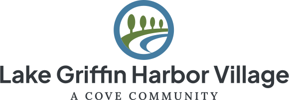
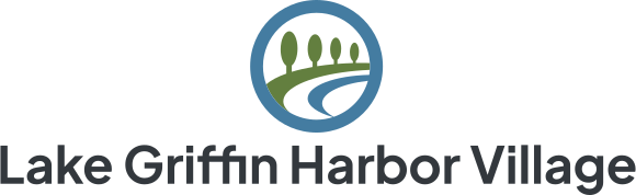
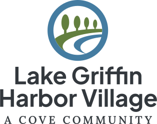
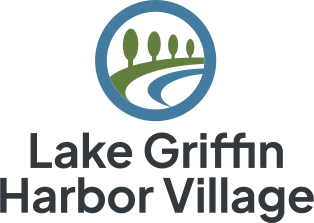
All eight are shown at the same scale, so you can compare the shapes directly. The two-line versions set the name a little larger, which is part of what they are for.
Horizontal is the default, and it is what you should grab unless one of the reasons below applies. Use it on anything wider than it is tall: letterhead, an email banner, the top of a flyer, or a name badge.
Centered is for spaces that are square or taller than they are wide. Signage is the usual case, which is why every sign in this guide uses it. Vehicle doors, the back of a shirt, and square social posts are the others.
Two Lines is for the longer community names. If the one-line version squeezes the name down so far that it is hard to read in the space you have, the two-line version lets the name sit bigger in the same width.
No Tagline is not a way to make the logo smaller. The tagline sits under the name inside the same block, so taking it off does not make the logo any narrower, and barely any shorter. Use it where the tagline cannot be reproduced cleanly, embroidery and small vinyl lettering are the usual cases, or where the same words already appear right beside the logo. If the logo meets the minimum height in Space and Size, its tagline is readable.
Not every property has all eight. The arrangements exist where they are useful. A community with a short name will usually have no two-line versions at all, because there is nothing to break onto a second line. If you cannot find a particular arrangement, it was never drawn rather than lost. Every approved variation your property has is in Bynder.
If you find yourself reaching for something other than horizontal with the tagline, check with Marketing first. The reasons above cover most cases, but we may have a suggestion for your specific piece, or a version you did not know existed.
Approved Backgrounds

White and cream are what Word and PowerPoint documents use most. Putting the full-color logo in a white box works on any background, and it is how the logo appears on home sales signage. If you need something beyond these five, ask Marketing.
Space and Size
Leave a gap around the logo so nothing crowds it. The gap should be at least as tall as a capital letter in the name, on all four sides. In the Cove Communities logo that is the O in COVE, marked below. In a property logo it is the first letter of the property name, so the rule works the same with or without the tagline. Keep text, photos, and the edge of the page out of it.
How small can it go? Measure the height, not the width. Names vary a lot in length, so widths are all over the place, but every logo of one shape is built to the same proportions, and one height covers all of them. At these heights the smallest lettering, the tagline, is still about a millimeter tall and prints clean.
| Shape | Minimum height in print | Minimum height on screen |
|---|---|---|
| Horizontal, any property, plus the Cove Communities and Cove Home Sales logos | 3/8 inch (0.375 in, about 10 mm) | 60 pixels |
| Centered, one or two lines | 5/8 inch (0.625 in, about 16 mm) | 110 pixels |
Height is the whole logo, top to bottom, tagline included. A horizontal logo at this height is 300 to 400 pixels wide depending on the name, which is wider than a phone screen, so narrow spaces take the two-line or centered version. If the space cannot fit that either, it is too small for a logo. Ask Marketing about the alternatives.
Is Your File Current?
Sage and Slate mark, refreshed palette. This is the one to use.
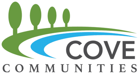
If your file looks like this, it’s out of date. Delete it and download a current one.
Logo Misuse
What tends to go wrong, and the quick fix for each.
Resize from a corner handle only. Corners keep the shape locked in Word, PowerPoint, and Canva.
It happens when someone drags a handle in the middle of an edge instead of a corner.
Cove and every property have finished logo files in Bynder, with the lettering and tagline already set.
 COVE
COMMUNITIES
COVE
COMMUNITIES
Retyping gives you the wrong font, spacing, and weight. The same goes for property names and taglines, so reach for the file rather than setting them by hand.
Full color, navy, charcoal, black, white, or cream. Nothing else.
Including tinting it to match a flyer’s accent color or a photo.
The logo is finished artwork, and it works best left alone.
Also: bevels, gradients, and WordArt effects.
Anything carrying our logo comes from a real design file, downloaded from Bynder.
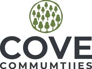
AI tools redraw it wrong: garbled text, wobbly marks, invented details. This example was AI-made from our real logo. Look closely at the spelling.
Also Avoid
this season…Still to add with real artwork: the logo on a busy photo, with nothing behind it to lift it off the background.
Before You Send It Out
| 1 · Is it still the right shape, not stretched or squashed? |
2 · Is it the right file? .pdf for print, .png for screens. |
| 3 · Is there a gap around it at least as wide as the O, all the way around? |
| 4 · Is it tall enough? At least 3/8″ (0.375″) for horizontal or 5/8″ (0.625″) for centered in print, and 60 or 110 pixels on screen. |
| 5 · Is it the current 2026 version? |
| 6 · Is it the right logo for the piece? A property logo for a piece about that property, the Cove Communities logo for anything company-wide or covering several properties. |
The Three Logo Families
Bynder organizes logos as MH, RV, and Home Office. Mirror that split rather than inventing a taxonomy. Scope is 25 in-scope properties (16 MH + 9 RV) plus Cove Communities and Cove Home Sales; ten Canadian properties were descoped 2026‑06‑16.


Type in the Lockup
Property name, Plus Jakarta Sans 700, title case, 0 tracking, metrics kerning. Tagline, Lora SemiBold 600, all caps, 420 tracking (letter-spacing: 0.42em), metrics kerning.
The 2026 source doc is wrong on case. It specifies all-caps property names; the artwork is title case (“Bear Creek Village”). It’s the tagline that’s all caps. Three intentional all-caps exceptions: Point Sebago, Cove Home Sales, and Cove (Home Office).
Tagline Rules, Verified Against All 25 Packages
MH properties always read A COVE COMMUNITY, invariant, regardless of whether the name ends in “Village.” Sun Valley, The Waters, and The Meadows all carry the identical tagline.
RV taglines vary by setting and amenity tier, assigned from a controlled vocabulary. They are never composed on the fly, and bare “A Cove Resort” does not exist:
| Property | Tagline |
|---|---|
| Big Pine Key RV | A COVE OCEANFRONT PARK |
| Blueway RV | A COVE GULF COAST PARK |
| Chokoloskee RV · Holiday RV | A COVE PARK & MARINA |
| Lake Jasper RV · Oak Harbor RV | A COVE LAKESIDE PARK |
| River Vista RV | A COVE RIVERFRONT PARK |
| CreekFire RV | A COVE LOW COUNTRY RESORT |
| Point Sebago | A COVE LAKEFRONT RESORT |
Intentional Exceptions, Features, Not Errors


Point Sebago uses an all-caps wordmark and its “A” is drawn as a picnic table, a nod to the property’s original logo. Big Pine Key RV’s bubble mark uses palm trees instead of the generic trees every other property shares, a coastal variant. Cove Home Sales is stacked, all caps, and carries no tagline (renamed from “Cove Homes” in 2026).
Lockup Variant Matrix
Orientation horizontal (primary) or centered (signage) × name wrap 1-line or 2line × tag / notag.
Terminology: what older planning docs call “Vertical” is now 2 Line, same layout, renamed. Use “2 Line”.
Most MH packages ship 8 variants (long names need the 2-line wrap). Properties without 2-line: Sun Valley, The Meadows, The Waters, and all RV except Point Sebago, deliberately skipped where the treatment didn’t suit the name (notably CreekFire RV and Big Pine Key RV). Not an export oversight; don’t go looking for them.
Six colorways: fullcolor navy charcoal black white cream. Web = RGB (.svg .png transparent, .jpg white-bg) · Print = CMYK (.ai .eps .pdf). All rasters ship at a single 2048px size.
White and cream ship without JPG, JPG bakes in a white background, so a white logo would be invisible on it. That’s the white-box problem expressed as a production rule.
All type is outlined in every vector export, no live fonts, no font dependencies. Vendors don’t need Jakarta or Lora installed to place a lockup.
Reading a Filename
BCV-bear-creek-horizontal-tag-fullcolor-cmyk.ai
= [prefix]-[property]-[orientation+tagline]-[colorway]-[gamut].[format]
Each property has a three-letter prefix, BCV, BPK, CKF, PSR, RVV, and so on.
Sub-Brands Awaiting the 2026 Refresh
A handful of marks have not yet been redrawn in the 2026 system: Cove Cares (and the Cove Cares Giving Match), Big Cypress Grill, and the Point Sebago restaurant logo, with possibly one or two others. They are on the rework list. Until then, request current artwork through the Marketing Request Form rather than reusing old files.
Spot color and embroidery. Proposed PMS equivalents are defined in the Color section below. DST embroidery files are not distributed by Cove: your embroidery vendor produces the DST from our vector artwork, which every print package contains. Per-community “Cove Home Sales at {Community}” lockups remain deferred.
Further Prohibited Treatments
Beyond the everyday list: disassembling or re-spacing the mark and wordmark; using the logo as a repeating pattern or faint watermark; adding unofficial taglines beneath the mark; masking imagery inside the letterforms; co-branding with a partner logo without correct relative sizing and spacing; and applying it across panel gaps or door seams on vehicles.
Multi-Mark Hierarchy
Unresolved: when a property lockup, Cove Home Sales, a golf sub-brand, and the EHO mark must coexist, order, relative sizing, and spacing all need defining. This will come up first on home-sales signage.
Production Note
Every distortion on this page is generated live from the real logo file via CSS transforms, so the examples can never drift out of sync when the artwork is updated.
Three properties carry a distinct golf sub-brand: Point Sebago Golf Resort, Big Cypress Golf Club (Cypress Lakes Village), and Rolling Greens Village Golf Club.
No approved direction exists. A decision one-sheet went out 2026‑06‑22 presenting three routes (Current / Rebuilt / Reimagined badge, badge recommended) and has had no response. Naming decisions also remain open. Golf artwork is absent from the export folder, so this section cannot ship in v1.
Color
Five colors, used consistently. Pick one of the combinations below and you can’t go wrong, they’re all checked for readability.
Approved Combinations
These are the pairings to use. Each one is a background and a text color that work together, don’t mix and match your own.
Charcoal text The default. Use this for most documents.
Cream text For covers, headers, and strong panels.
Navy text Clean and formal, letters, reports.
White text For highlights and callout boxes.
Cream text Footers and quieter dark panels.
Need something outside these combinations? Ask Marketing, marketingteam@covecommunities.com. There are more colors in the system, but choosing when to use them takes a bit of care, so we’d rather help than have it go wrong in print.
The Colors Themselves
If you need to set a color by hand, in Word, PowerPoint, or Canva, these are the five. Click any value to copy it.
To use one in Word or PowerPoint: Font Color, More Colors, Custom, then paste the value into the Hex box. Canva has a hex box in its color picker too.
Sage Green leads, it’s the color that makes Cove feel like Cove.
Semantic Roles
Sage and Slate are both brand-primary, the logo uses them as a pair, but each carries one job so nothing is decided by taste.
| Color | Role |
|---|---|
| Sage Green | Lead brand color, nature, outdoor lifestyle |
| Slate Blue | Supporting, water, sky, secondary panels |
| Navy | Structural anchor, headers, deep panels, headings |
| Charcoal | Default body text |
| Cream | Default page background |
Core Ramps
Tints are press percentage screens, multiply each CMYK channel by the percentage, so a printer reproduces them exactly with no color matching. The hex values are the parallel digital equivalents. “Deep” is digital-only: a screen can only lighten, so a darker ink needs a real Pantone or CMYK build (Phase 2).
#EEF2EB#DEE5D7#BDCBB0#627F3F#314B03#ECF1F6#D9E4EC#B3C9D9#447CA1#05486B#E7EAEF#CFD5DE#A2ACBE#273B61#010D30#E8E9EA#D2D3D4#A7A9AB#33373C#090C11Accent Colors Marketing & Partners Only
Deliberately absent from the everyday view. Property teams encounter these pre-applied, on SOLD riders and in templates, and never have to decide where an accent goes. Accents are used at full strength only: no tint ramps.
Roles: Campfire Red = urgency, Sold, alerts · Sunset Orange = CTAs, warm promotion · Golden Amber = badges, seasonal callouts.
Neutral Ramp
The palette’s biggest gap filled, between Cream and Charcoal there was nothing for rules, borders, dividers, secondary text, or disabled states. Interpolated in perceptual color space, running between the two existing brand neutrals rather than introducing new ones.
#FFFFFFCards, max contrast#F4F5F0Default background#D6D8D4Subtle panel, alt row#BDBFBDHairline rules, borders#A1A3A3Dividers, disabled fill#878A8BDisabled text#717476Icons, de-emphasized#5C6063Secondary / caption#494D51Strong secondary#33373CDefault body textContrast, Measured, Not Assumed
The 2026 source doc lists eleven “Accessible Pairings (WCAG AA)” without distinguishing text size. One doesn’t meet AA for normal text, and two more pass by hundredths.
| Pairing | Ratio | Safe for |
|---|---|---|
| Charcoal on Cream | 10.94:1 | Any size · AAA |
| Navy on Cream | 10.17:1 | Any size · AAA |
| Campfire Red on White | 6.62:1 | Any size |
| Campfire Red on Cream | 6.04:1 | Any size |
| Golden Amber on Charcoal | 5.83:1 | Any size |
| Golden Amber on Navy | 5.42:1 | Any size |
| Sunset Orange on White | 4.84:1 | Any size |
| Sage Green on White | 4.54:1 | Any size · by a hair |
| Slate Blue on White | 4.52:1 | Any size · by a hair |
| Sunset Orange on Cream | 4.42:1 | Large text only |
The rule, stated once instead of eleven times.
Text-safe at any size on white or cream, Navy · Charcoal · Campfire Red.
Large text only (24px+, or 18px+ bold), Sage · Slate · Sunset Orange. Sunset Orange now clears AA on white at any size, but not on cream, so treat it as large-only and it is right on both. Excellent as fills with white or charcoal type on top; the limit applies only to colored type.
Never colored type on a light ground, Golden Amber (2.06:1 on white, failing even large text). Use as a fill with Charcoal on top, or reverse out of Navy, where it now clears AA at any size.
Spot Color: PMS and TCX Equivalents
Cove is defining its spot standard, not matching a legacy one. These are nearest matches computed in CIELAB with CIEDE2000, across the full Pantone Solid Coated set for PMS and the full Fashion, Home + Interiors set for TCX. Verify against a physical fan deck before the first production run; screens cannot be trusted for Pantone.
PMS is the printing ink. TCX is the textile and product standard, and it is the one to quote for apparel, embroidery thread, promotional items, and paint. They are different systems, so a color can match well in one and poorly in the other.
| Color | PMS (print) | TCX (apparel & product) | Note |
|---|---|---|---|
| Sage Green | PMS 575 C | 18-0332 Grasshopper | Nearest in both sets, but the TCX match is loose |
| Slate Blue | PMS 5415 C | 17-4131 Cendre Blue | Not a solid match. Print as CMYK wherever the process allows, see below. TCX is excellent |
| Navy | PMS 534 C | 19-4029 Navy Peony | Close in both |
| Cream | No spot | 11-0601 Bright White | An exact TCX match; in print, CMYK 3/1/4/0 or let the stock carry it |
| Charcoal | PMS 432 C | 19-4218 Vulcan | Nearest available; confirm vs 426 C on the deck |
| Campfire Red | PMS 7627 C | 18-1555 Molten Lava | Close in both |
| Sunset Orange | PMS 471 C | 18-1249 Hawaiian Sunset | Confirm vs 160 C on the deck |
| Golden Amber | PMS 124 C | 14-0951 Golden Rod | Close in both; confirm vs 7409 C on the deck |
Slate Blue has no true spot equivalent. Print it as CMYK 77/44/22/2 wherever the process allows.
Nothing in Solid Coated gets closer than roughly 4.7, which is a plainly visible difference rather than a match. The nearest by measurement, 7461 C, is a vivid cyan that reads wrong beside a muted slate, so 5415 C is listed instead: fractionally further by the numbers, considerably closer in character, and the one to compare on a physical deck.
This is a limitation of the ink library, not of the color. The hex and the CMYK build are both approved and both exact; only the spot equivalent is a compromise. Treat 5415 C as a last resort for jobs that genuinely cannot run process color, and specify it by eye against a deck rather than by number. For apparel, embroidery, and product, use the TCX value instead, where the match is excellent.
Retired
The previous 33-color regional system is withdrawn. One palette, all regions.
Typography
Two fonts, and that’s it. On a Cove computer they are already installed, so you can pick them straight from the font menu. On a personal machine, both are free to download.
The Styles
Five styles cover almost everything you’ll make. The sizes are for letter-size documents; scale up for posters and signs, and ask Marketing when unsure.
| Big HeadlinePlus Jakarta Sans ExtraBold · 30 pt | Welcome to Cove |
| HeadlinePlus Jakarta Sans Bold · 22 pt | Welcome to Cove |
| SubheadPlus Jakarta Sans SemiBold · 17 pt | Welcome to Cove |
| BodyLora Regular · 11 pt | Neighbors become friends here, across 25 communities and resorts. |
| Small PrintPlus Jakarta Sans Regular · 8.5 pt | Captions, credits, and fine print. |
On Cove computers, both fonts are already installed. IT deployed them company-wide, so in Word and PowerPoint just pick them from the font menu. In Canva, both are already in the font list, so search for them by name. On a personal machine, or when a recipient might not have them (email!), use Arial in place of Plus Jakarta Sans and Georgia in place of Lora. If you see Calibri, the font did not load, and it is worth a fix before the piece goes out.
The Scale
Body runs deliberately large: 18 of the 25 properties are 55+ communities, so resident-facing material is read by older eyes. Nothing but legal copy goes below 9 pt.
| Step | Face / weight | Digital | Leading | Tracking | |
|---|---|---|---|---|---|
| Display | Jakarta ExtraBold 800 | 42 to 72 pt | 52 px | 1.05 | −2% |
| H1 | Jakarta Bold 700 | 30 pt | 36 px | 1.15 | −1.5% |
| H2 | Jakarta Bold 700 | 22 pt | 28 px | 1.20 | −1% |
| H3 | Jakarta SemiBold 600 | 17 pt | 22 px | 1.30 | −0.5% |
| Overline | Jakarta SemiBold 600, caps | 9 pt | 13 px | 1.20 | +10% |
| Body Large | Lora Regular 400 | 13 pt | 20 px | 1.55 | 0 |
| Body | Lora Regular 400 | 11 pt | 18 px | 1.60 | 0 |
| Body Small | Lora Regular 400 | 9.5 pt | 16 px | 1.55 | 0 |
| Caption | Jakarta Regular 400 | 8.5 pt | 14 px | 1.40 | 0 |
| Legal | Jakarta Regular 400 | 7 pt | 12 px | 1.35 | 0 |
Sanctioned Weights
Plus Jakarta Sans: Regular 400 · SemiBold 600 · Bold 700 · ExtraBold 800.
Lora: Regular 400 · Italic 400 · SemiBold 600 · Bold 700, display only · Bold Italic 700, titles over photos on the website only.
Two Lora weights carry a condition. Bold 700 is permitted for headlines and subheads at 30 pt / 36 px and above, where Pairing B needs Lora to hold presence, and never for body copy, captions, or legal. Bold Italic 700 is for titles set over photos on the website, at any size, where white type needs the heavier stroke to hold up on a busy image. State the condition wherever either weight is listed.
Off-limits: Light, ExtraLight, Medium 500. Medium was considered and deliberately dropped; SemiBold 600 covers the mid-weight need, including on signage.
The Two-Pairing Model
Serif-led layouts are an established Cove pattern, not an exception, ads with a Lora headline over Jakarta body tested well, and the current website runs serif headings over sans body. A type system doesn’t break because the serif sometimes leads; it breaks when nobody knows which to use when.
| Pairing | Headline | Body | Use for |
|---|---|---|---|
| A · Editorial default |
Plus Jakarta Sans | Lora | Informational and long-form, print collateral, operational documents, wayfinding |
| B · Campaign expressive |
Lora | Plus Jakarta Sans | Brand and lifestyle advertising, emotive hero moments, invitations, the website |
The website uses the Campaign pairing: Lora for headings, Plus Jakarta Sans for everything else, including body copy, navigation, buttons, labels, and forms. Serif body stays off screens, since it is harder to read at small sizes. Other screens, such as email templates and apps, keep Jakarta throughout with Lora as an accent until they get a decision of their own. Signage is Jakarta only.
Three invariants. One direction per piece, choose a pairing and hold it. One face leads, one supports, never serif over serif. CTAs are always Plus Jakarta Sans, in both pairings.
Fallback Stacks
font-family: 'Plus Jakarta Sans', 'Inter', 'Segoe UI', 'Helvetica Neue', Arial, sans-serif;
font-family: 'Lora', Georgia, 'Times New Roman', serif;
IT has deployed both faces to all Cove-managed machines, so the stacks above matter mainly for email, personal devices, and vendor handoff. Inter is the closest widely-available match to Jakarta; Georgia the best-matched near-universal serif. Both brand faces are OFL open-source, so vendors may install them freely, and logo files are outlined, so a sign shop needs no fonts at all to place a lockup.
A live example of why declared weights matter. covecommunities.com self-hosts Avenir at 400, 500, and 900 only, but the theme asks for font-weight: 600 and 700 in hundreds of places. With neither weight available, the browser snaps them all up to Heavy 900, so every bold headline, nav item, and button on the live site renders in Avenir Heavy. Declare the faces and the weights you actually use. Confirmed by computed-style audit in the September 4, 2026 website typography review.
The Website
covecommunities.com uses Lora for headings and Plus Jakarta Sans for everything else. One stylesheet, cove-typography.css, sets the type on top of the theme; sizes, colors, and layout follow the theme. This is the reference for Proven, Cove’s web partner, and for anyone touching the theme. Settled October 5, 2026. Proven adds it to the development site first, so until it goes live the site still shows the Avenir problem described above.
Lora weight follows size. Lora Bold only at 36 px and up, SemiBold below, at every screen width. Where the theme changes a heading’s size at a breakpoint, its weight changes at the same breakpoint. Titles over photos are the one exception: Lora Bold Italic at any size.
| Where on the site | Font and weight |
|---|---|
| Page titles and section headings | Lora: Bold at 36 px and up, SemiBold below |
| Card titles and subheads | Lora, by the same size rule, so mostly SemiBold |
| Accent titles, such as “Ways to Stay” | Lora Italic |
| Titles over photos | Lora Bold Italic, at any size |
| Body paragraphs | Plus Jakarta Sans Regular |
| Lead statements | Jakarta SemiBold |
| Small subheads and pull quotes (H4 to H6) | Jakarta SemiBold |
| Labels, category tags, and footer heads | Jakarta SemiBold, caps |
| Lifestyle tab titles, such as “GOLF COURSE” | Jakarta Bold, caps |
| Lifestyle icon labels | Jakarta Bold, caps |
| Property name above the page title | Jakarta SemiBold |
| Buttons | Jakarta SemiBold |
| FAQ questions and filter toggles | Jakarta |
| Navigation, menus, and search tabs | Jakarta: links and tabs SemiBold, dropdown menu titles Bold |
These stay in Jakarta, even where the theme uses heading tags: navigation and menus, buttons, forms, FAQ questions and filter toggles, labels, and the address and price on listing pages.
| Element | Line height | Letter spacing |
|---|---|---|
| H1 and H2 headings | 1.15 | −1% |
| H3 and card titles | 1.2 | 0 |
| Accent titles | 1.1 | 0 |
| Body paragraphs | 1.6 | Unchanged |
| Lead statements | 1.3 | Unchanged |
| Labels and eyebrows | Unchanged | +10% |
| Lifestyle icon labels | 1.25 | +8% |
| Lifestyle tab titles | Unchanged | +4% |
| Property name | Unchanged | +2% |
| Buttons | Unchanged | +5% |
Sizes follow the theme, with three fixes: lifestyle icon labels go to 12 px on tablet and phone (were 10 px), the property name above a page title to 20 px (was 24 px), and the RV booking tabs to 18 px on phones (were 20 px). In image-and-text blocks on desktop, a heading sits 16 px above the subhead under it (was 40 px).
Loaded: Plus Jakarta Sans 400, 600, 700, and 800; Lora 400, 600, and 700, plus italic 400 and 700. One Google Fonts request. Never Medium 500 or Light 300.
Tagline Lockup
Lora SemiBold 600, all caps, 420 InDesign tracking = letter-spacing: 0.42em. A named one-off, not a scale step.
Iconography Specs Only
Font Awesome is the icon system, a bought library applied consistently beats a bespoke one that drifts. Community maps are the one place a different set is used: map symbols, covered at the end of this section. Everyday users never place icons, so this section is specs-only.
Font Awesome 7 Pro, Standardized on 7.3
Cove holds a Pro license, self-hosted. The live site still runs FA 6 Pro, a version upgrade to schedule, not a new purchase. Class syntax is unchanged from v6 (fa-solid, fa-regular, fa-light, fa-brands); the CSS family name changes from "Font Awesome 6 Pro" to "Font Awesome 7 Pro".
Solid Is the Standard Style
Every Pro style is available, but Solid is the default across print and digital and should cover nearly everything, matching existing practice (about 50 of 55 icon instances on the homepage). Deviations are deliberate and rare, not a matter of taste. Solid is also the most forgiving at small print sizes and on vinyl, which makes it the right signage default too.
Two considered exceptions, one follow-up. The home sales sign riders use line icons at a set weight rather than Solid; that is decided, not drift, and the rule lives in Signage (two-line riders carry a line icon, one-line riders are text only). Solid holds up on simple silhouettes but loses the interior lines that carry meaning at sign scale. Community maps use a symbol set of their own, covered in Community Maps Use Map Symbols below. The follow-up: the site loads Solid 900, Regular 400, and Light 300; if Solid covers everything, the other two can leave the build, shrinking the payload and making the standard self-enforcing.
The Grid Is 512 Tall, Not Square
This is the detail that makes custom icons match or not. Font Awesome draws on a fixed 512-unit height with variable width, widths run 320, 384, 448, 512, 576, and 640 across the solid set. Match the 512 height and let width fall where it naturally does. Forcing everything into a square is the most common way a custom icon reads as foreign.
 384 × 512narrow
 512 × 512square
 576 × 512wide
 640 × 512widest
 512 × 512square
 512 × 512square
All six sit on the same 512 baseline height, the widths differ. Shown in Solid.
Custom Icons
Roughly 80% of need is covered by the library. When something genuinely isn’t there, match the 512-unit height plus Solid’s stroke weight, terminal shapes, corner radius, and optical padding, so the addition is indistinguishable from a library icon. Custom icons live in a dedicated Bynder collection with a naming convention, today ASSETS/ICONS/ holds a single stray SVG, which is how fragmentation begins.
License trap, state this to every partner. FA Pro is a paid, self-hosted license. An outside vendor, freelancer, or sign shop almost certainly does not have it. Never hand off a layout that expects them to pull from the library, supply the specific SVGs with the artwork.
Community Maps Use Map Symbols
Community maps are the exception. Their symbols come from the Cove map symbol library: the National Park Service map symbols, plus Cove-drawn symbols in the same style where the Park Service set has none. They read at a glance at map size, people know them from park signs, and the Park Service symbols are public domain. Everywhere else, Font Awesome 7 Pro Solid.
 Dog ParkPark Service
 Picnic PavilionPark Service
 Guest ParkingPark Service
 MaintenancePark Service
 Home Sales OfficeCove-drawn
 PickleballCove-drawn
 Hot TubCove-drawn
 Golf CartsCove-drawn
Shown in Charcoal, as they sit in lots, areas, tags, and the legend. A symbol on open field goes white on a Navy rounded badge.
- Maps only: the map, its legend, and its tags and badges. A feature that needs an icon on a map and on the website gets two, a map symbol for the map and a Font Awesome icon for the site.
- Cove-drawn symbols follow the Park Service construction: simple, clean geometry with true circles, even-width limbs, and few anchor points.
- The grid is square. Unlike Font Awesome’s 512-unit height, every map symbol sits in the same 22-unit square. Size a symbol by that box, not by its ink, so symbols at one size share one box and one center line. Never smaller than 11 pt on a map.
- No Park Service branding. The symbols are free to use; the Park Service arrowhead emblem never goes on a Cove piece.
Photography
Real people, real places, natural light. Cove photography looks like somewhere you’d actually want to spend a Saturday.
Three kinds of photos do almost all the work here, and each has its own job: professional photography for marketing and the website, listing photos for homes and cottages that are for sale, and candid lifestyle shots taken on a phone at events. The standards below are grouped that way.
Six shots that show the standard. Four are about people, because that is what the places are for.
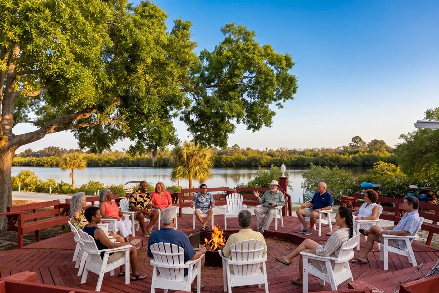
River Vista RV · warm light, real gathering, nobody posing

Rolling Greens Village · the hour after sunrise or before sunset does the work

Blueway RV · movement and daylight beat a staged portrait
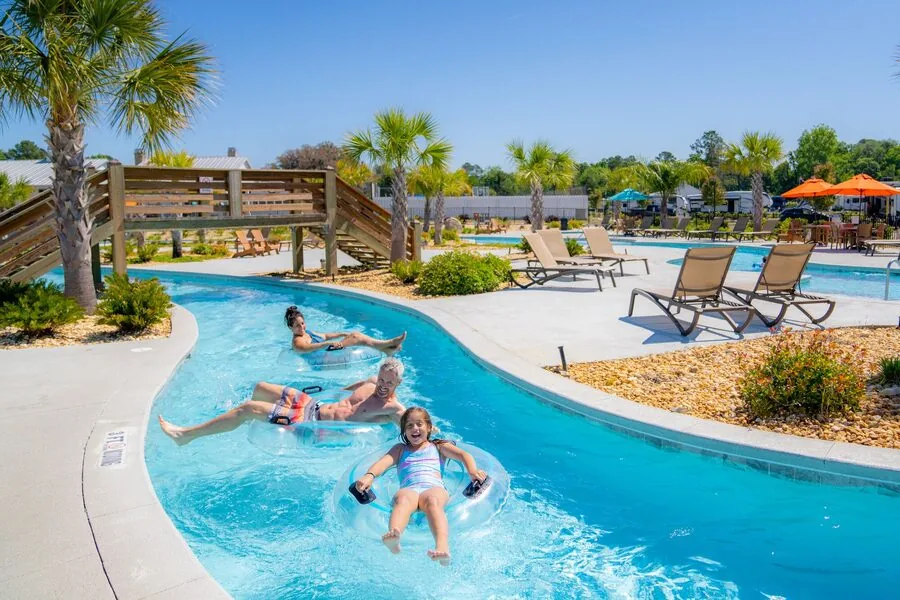
CreekFire RV · grandparents and grandchildren in the same frame
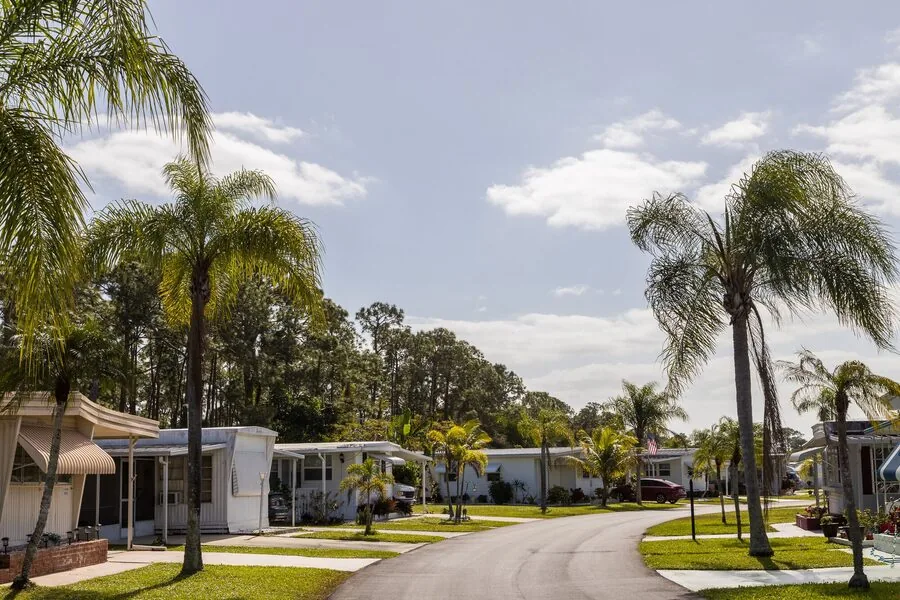
Estero Bay Village · homes and landscaping, shot straight
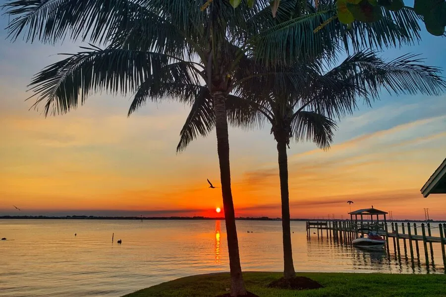
The Waters · one atmospheric shot per set, not five
All six are in Bynder at full resolution. Drone and aerial shots have their place, but a set made only of them reads like a brochure for land rather than a place people live.
What Makes a Photo Feel Like Cove
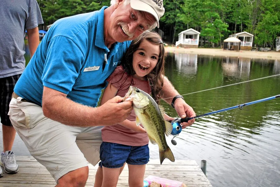
Natural daylight · real residents and staff · outdoor and water · relaxed, unposed moments · space and landscape.
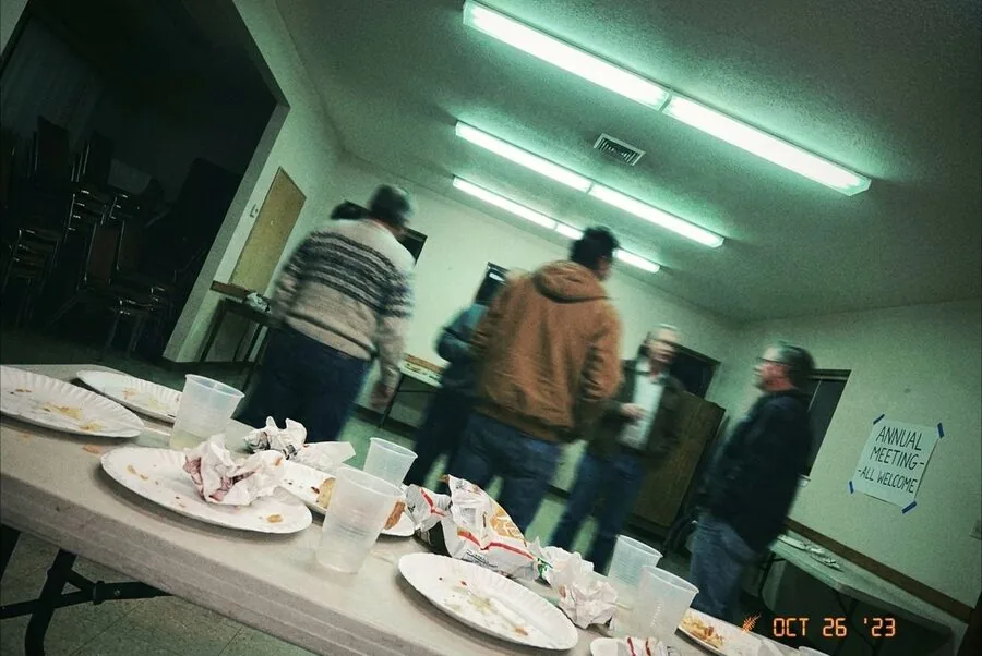
Harsh flash · tilted framing · clutter in the foreground · heavy filters · empty, lifeless spaces. (Staged example, nobody’s real photo.)
Professional Photography
Commissioned shoots, drone work, and the big images used in campaigns. These are already made for you, so you can download one rather than arrange a shoot of your own. Everything lives in Bynder.
No account? Photography sits behind a login and seats are limited, assigned to Property Managers, Lifestyle Managers, and Marketing. Request access through the Marketing Request Form (“Bynder Access”).
Got great photos? Send them in, you don’t need an account. Go to the Bynder login page, find the “Drag & drop your files here” box beneath the login, and drop them in.
Always add a note saying who you are, which Marketing team member to notify, and the event, property, and date. Without it we can’t tell whose photos they are or what they show. The per-community contact list is on the intranet page.
Home Listing Photos
Good photos sell homes faster, and your phone is enough. Remember the 3 L’s.
Less
Clean it up. Hide clutter, personal items, and pet gear. Turn the TV off. Think “fancy vacation rental.”
Light
Open every blind, turn on every light, and turn the flash off. Golden hour (the hour before sunset) is magic.
Lines
Shoot landscape, grid on, phone at chest height, and straight up and down so walls don’t lean.
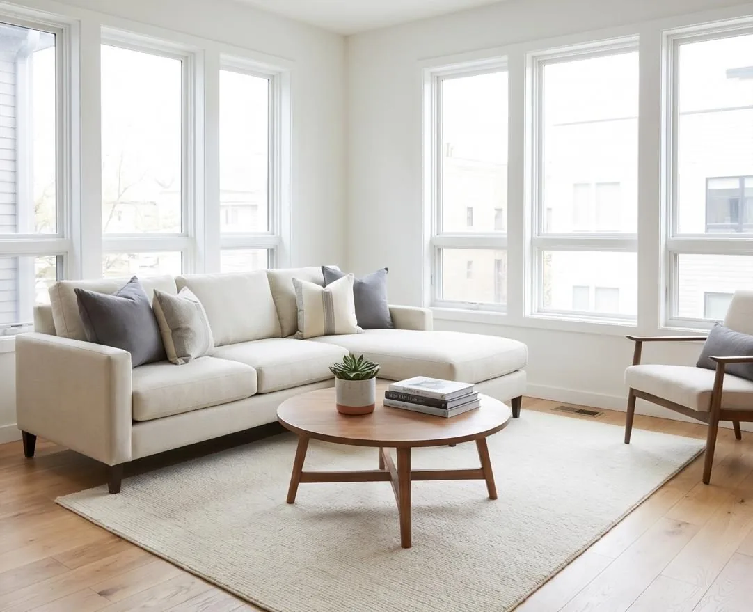
Room cleared, blinds open, phone level. This is the whole trick.
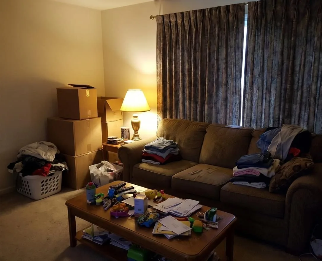
Laundry, boxes, closed curtains, lamp-lit. Buyers can’t picture themselves here.
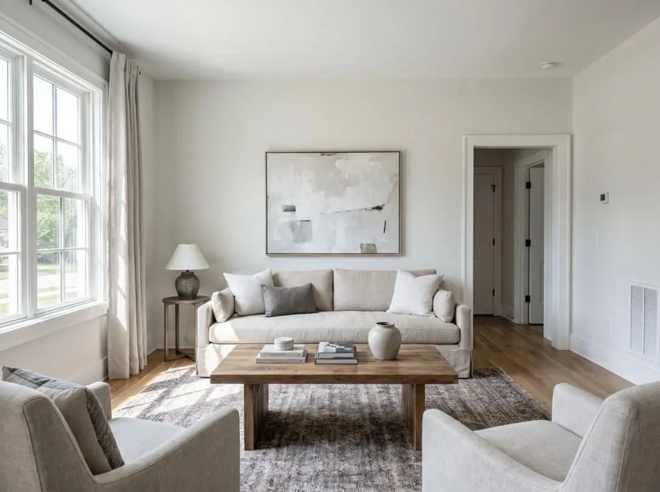
Phone perpendicular to the floor. Verticals stay vertical.
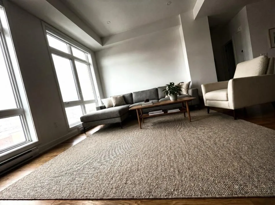
Tilted up or down, the room looks like it’s falling over.
The 30-second edit: straighten, brighten a touch, and skip the filters. Buyers want accurate. Full training, including where to stand and the pre-shoot phone setup, is in the Shoot to Sell deck, on the marketing intranet (staff). Marketing can also virtually stage an empty home from one good source photo.
Virtual Staging
An empty room is hard to picture living in. Virtual staging adds furniture to a photo of a home that is actually empty, so a buyer can see the space working. We can do this in house.
Ask your regional sales manager. We do the staging in house so it stays consistent and every image carries the disclosure it needs, which is the line you can see in the corner below.
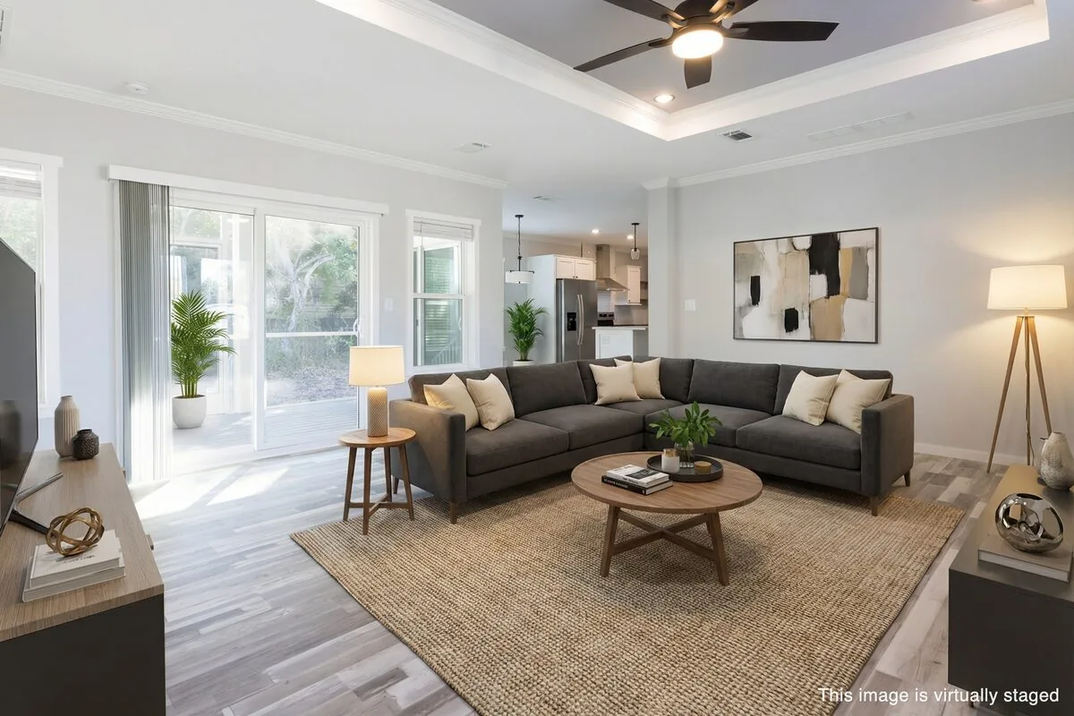
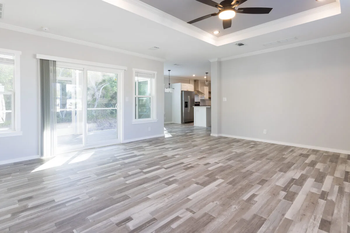
Camelot Lakes Village, 5675 Camelford Ct. Drag the handle to compare.
Candid Lifestyle Photos
Same principles, faster pace: daylight over flash, hold steady, get close to real moments instead of shooting the whole room from the back. A few good shots beat fifty rushed ones, and photos of people enjoying themselves beat photos of the buffet table.
Send the keepers to Bynder (the upload box under the login, with a note saying who you are, the property, the event, and the date). They become next season’s marketing.
Ask before you shoot, and again before it goes out. A quick “mind if this ends up in the newsletter?” at the event is enough for adults. Children need a parent’s okay before they appear anywhere, and anyone who says no stays out of the frame. Marketing is writing the full rule; until it lands, this is the standard.
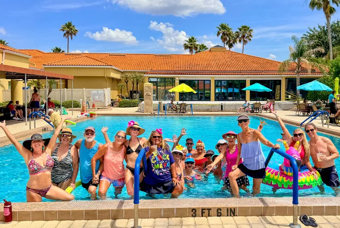
Close enough to see faces, shot from in among it rather than the doorway
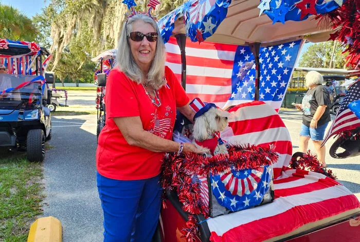
Daylight, no flash, and someone clearly enjoying themselves
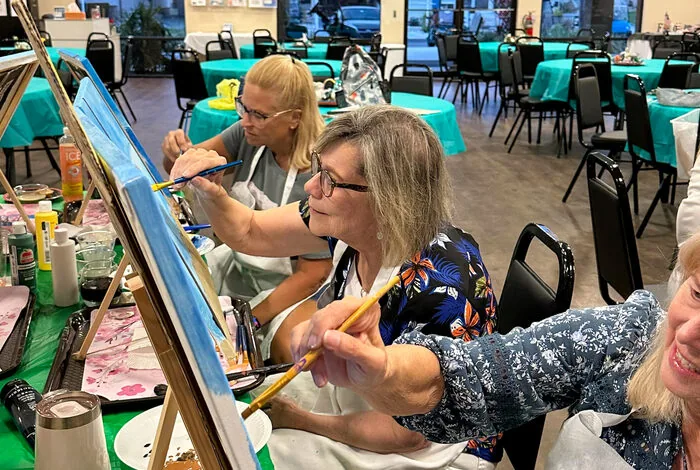
Taken while it was happening, so nobody is waiting on the camera
All three were taken on phones by community staff. None of them needed a photographer, and every one of them is usable.
Phone Video
The same rules apply when it moves. Hold the phone upright for Reels and Stories, keep it steady (brace an elbow or lean on something), and let the moment happen in front of you rather than panning around to find it. Ten to twenty seconds is plenty. Don’t zoom; step closer. Daylight beats any indoor light. Ask before you shoot, the same as a photo, and send the keepers to Bynder with the same note.
Please don’t use AI-generated images or designs. That covers photos, flyers, and graphics. Real photos of your actual community always win. See Using AI.
Still to Define
- Shot-list categories, amenity, lifestyle, resident, aerial, interior, event, so gaps in the library become visible.
- Crop ratios per use: 16:9 web hero, 4:5 and 1:1 social, 9:16 stories, 3:2 print.
- Color grading, a reference set or LUT, so shoots by different photographers match.
- Text-on-photo scrims, which color at what opacity, tied to the contrast rules in Color.
- Bynder tagging taxonomy, property, state, city, amenity, season. Metadata is what makes a library findable rather than merely large.
- Model release tracking, needed before resident photos run in paid media.
Signage
Signs are the most-seen thing we make. Home sales signage in particular is high-volume, so it’s worth getting right.
Signs fall into two families. Home sales signs are the high-volume ones: the framed panel outside a listing, the riders that change as it sells, and the smaller staked format used for brokered listings where a community caps sign size. Everything else covers the A-frames and feather flags that move around a property, and the operational signs that stay put all year. Both families are ordered the same way, through Marketing, but they follow different rules.
Home Sales Signs
Home sales signs come as a set: a main panel with the property logo, and one or two swappable strips called riders. Everything prints in full color on a stiff plastic panel that clips into a metal frame. There are two builds, and which one you order depends on the frame the community already has.


- Top rider
24″ × 6″ - Main panel
24″ × 18″ - Bottom rider
24″ × 6″ · phone
Sun Valley in a white frame. The phone number sits on its own strip, so the main panel never has to change.

- Top rider
24″ × 6″ - Main panel
24″ × 18″ · phone built in - Bottom rider
none
Bear Creek Village in a black frame. With only one slot, the phone number is printed into the main panel instead.
Find out which frame the community has before anything prints. It is the one question that decides which panel we send to press, and the two panels are not interchangeable. The double-rider frame is the standard. If a quote or a request mentions “24 by 24 bracket holders,” that is the single top-rider build: an 18″ panel with one 6″ rider slot above it. Count the slots on a frame already standing in the community, or ask us and we will work it out with you.
A single rider always goes on top. If your frame only takes one rider, it sits above the main panel, never below it.
Frame color. White powder coat is the standard, and it is what to specify by default. Black is a sanctioned alternative where white is unavailable or carries a real premium, and it is not worth delaying an order or paying more to avoid. Both are shown above.
Riders: Messages You Can Order
Twenty rider designs exist. Pick from these rather than requesting custom wording. Riders are ordered separately from the main panel, so you can restock them as listings move. They are grouped here by the job they do.
Status
Where the home is in the selling process. These are the ones that change most often.


Features
What the buyer gets. Golf Cart Included and Water View go up only where they are true, so hold them back for the homes that earn them.


Hooks
A reason to slow down and look. Good for a listing that has been sitting, or one you want people to walk into.


Directional Arrows
Charcoal and red. Point people from the street to the home.


Order more riders than frames. The panel stays put and the rider is what changes, so a spare stack means the right message is always on hand instead of waiting on a reprint.
The top slot rotates with the situation. Put Open House or Agent on Duty up for the day of the event, then swap back to something evergreen like Gorgeous Inside or Furnished.
Phone riders go with the double-rider build only. On a single-slot frame the phone number is already printed into the main panel, so a phone rider has nowhere to sit.
Phone numbers on signs take hyphens, 813-291-7413, like everything else. Signs already up with parentheses stay until they are replaced. Anything printed from now on, reorders included, uses hyphens.
Open House Directionals
On open house day, these get people from the entrance to the door. Each one is 24″ × 18″, self-contained with the property logo, OPEN HOUSE with an arrow, and the phone number, and it goes on a metal stake at the corner or the turn rather than in a frame. Three arrows cover every intersection.

Turn here

Keep going

Turn here
Sun Valley shown. A left arrow seen from the back is a right arrow, so one two-sided board can serve both directions. Order them through Marketing like everything else. They do not replace the Open House rider, which still goes on the listing’s own frame that day.
Communities That Cap Sign Size Under Review
Some communities limit how large a home sales sign may be. The limit comes from the community’s prospectus, and which sign you order depends on who owns the home.
Size limits are under review. The allowed sizes and rules vary from one community to the next, so what follows is not the full story yet. Treat it as the current rule, ask before you order, and expect community-by-community guidance here once the review is done.
- Cove-owned inventory (a home Cove owns and is selling) gets the standard sign: the full-size framed panel with riders, exactly as at any other community.
- Brokered listings (a home Cove is selling on behalf of its owner) follow the size the prospectus allows. That is the smaller staked format below: a single square panel on a heavy-duty wire stake, pushed straight into the ground like a standard yard sign. No frame, and no riders, so the phone number is printed into the panel.

- Panel
12″ × 12″ · phone built in - Riders
none - Frame
none · wire stake - Stock
as the 24″ × 18″ panels
Camelot Lakes Village shown, brokered-listing size. Camelot East follows the same format.
Not sure whether your community caps sign size, or which size a listing needs? Ask before you order. We can check in a minute, and it saves you a reprint.
The headline follows the property type: “Cottage for Sale” at RV properties, “Home for Sale” at MH communities. It comes pre-set on the panel, set in a navy block outlined in white, and there’s nothing to decide. Both builds carry the same treatment, so the two sit side by side in a community without looking like different signs.
Order signage through Marketing. Please don’t place an order with a sign vendor yourself. Every piece of printed signage comes through us so we can check it before it goes to press, and we’re glad to help make sure it comes out looking right. Use the Marketing Request Form (“Re-print orders”).
Other Sign Types
Home sales signs are the high-volume item, but they are not the only thing on a property. The three below are examples, not the full list. Sign types get added as communities need them, so if you need something you don’t see here, ask rather than assuming it doesn’t exist. Property entrance and wayfinding signage is handled by Marketing and is not self-serve.
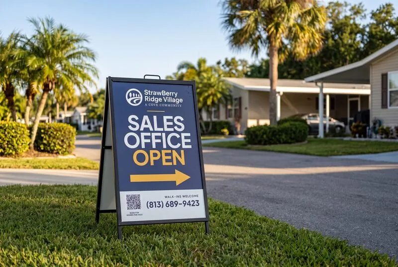
24″ × 36″ · directional, moved to wherever it is needed
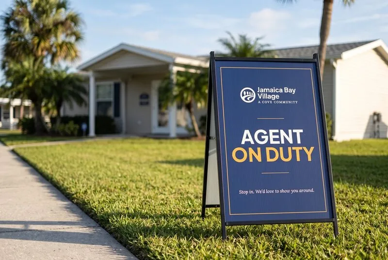
24″ × 36″ · sits outside the office while it is staffed
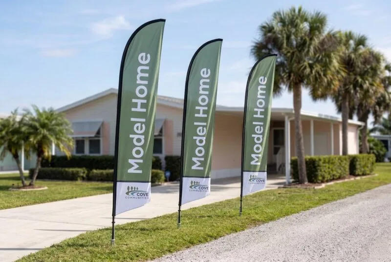
Model home, homes for sale, now leasing · sage, navy, or slate
Feather flags come in three color versions so they read against whatever they are standing in front of. Order them through the Marketing Request Form like any other sign.
Operational Signs
Not everything on a property is selling a home. Pool rules, wayfinding, safety notices, and amenity hours all carry the brand too, and they are the signs residents actually live with day to day.
The two below are examples, not the catalog. There is a far wider library of operational signage than this, and it keeps growing. These are here to show what the brand looks like on this kind of sign, not to tell you what you can order.
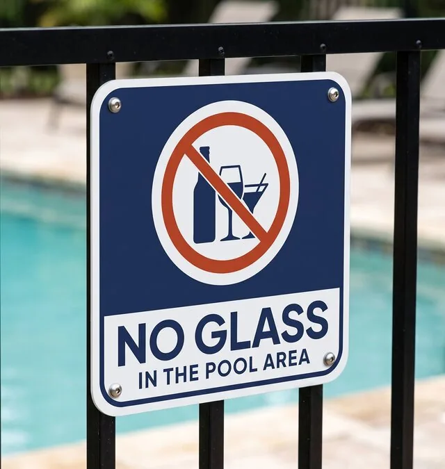
12″ × 12″ · plain language, one instruction
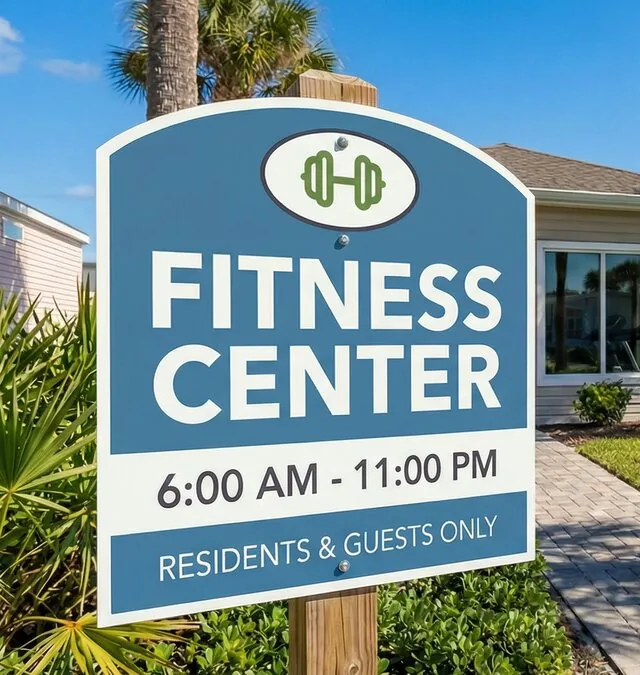
Amenity name, hours, and who it is for · post-mounted
To see what already exists for your community, or to ask for something that does not, submit a Marketing Request rather than making a sign locally. That is how the set grows.
Home Sales Sign Construction
| Element | Size | Contents |
|---|---|---|
| Main panel, double-rider build | 24″ × 18″ | Horizontal property lockup with tagline in a white block + headline in the navy keyline panel (“Cottage for Sale” / “Home for Sale”) |
| Main panel, single-rider build | 24″ × 18″ | Two-line centered lockup with tagline in a white block at the left, headline in the navy keyline panel, charcoal phone bar built in |
| Top rider | 24″ × 6″ | Rotating status, feature, or hook message |
| Bottom rider | 24″ × 6″ | Phone number. Double-rider build only |
| Brokered panel | 12″ × 12″ | Lockup, headline, and phone built in. Wire stake, no frame, and no riders |
| Open House directional | 24″ × 18″ | Self-contained: logo, OPEN HOUSE with an arrow, phone bar. Stake-mounted, no frame, and no riders. Two-sided printing serves left and right from one board, because a left arrow seen from the back is a right arrow |
Material: 4 mm coroplast, full color, CMYK, 0.25″ bleed with trim marks, clipped into a powder-coated H-frame. Kept out of the everyday tier because ordering runs through Marketing, so nobody upstream has to specify it.
Ink margins. Frame lips and slide-in channels hide up to 0.5″ of each edge, so design for a 0.75″ minimum ink margin; 1.0″ is comfortable. On a rider, ink width is 21.5″ (1.25″ side margins) with top and bottom margin of at least 0.75″. If an icon is the tall element, shrink the icon and leave the text size alone.
Type. Plus Jakarta Sans Bold everywhere on signs; Lora SemiBold only inside the logo tagline. Headline tracking 25. Stacked display caps lead at about 0.95 em, which puts the cap gap at 0.23 to 0.24 cap heights. Phone numbers take hyphens, 813-291-7413 (set October 5, 2026; older files used parentheses). The digits are ink-centered on the bar, and each hyphen is baseline-shifted about 0.10 em so it sits on the cap-height center rather than low.
Double rider is the target standard (top + bottom). Legacy single-rider frames remain in the field, document both and mark clearly which is current, so nobody orders into the old system. Confirm the frame before printing, since it decides which of the two 24″ × 18″ panels goes to press.
Headline Treatment
Navy panel with a 12 pt white keyline on the slate field, on every panel, the single-rider build included. That build previously ran a slate keyline frame on the slate field; it was changed to navy on September 18, 2026 for contrast, and navy panel plus white keyline is now the headline treatment across the set.
The HOME / FOR / SALE block (or COTTAGE) is ink-centered line by line, not centered by justification, which leaves trailing tracking on the right. Size it to about 81% of the panel’s inner box in both directions. That ratio is the reusable number; compute the scale from the frame rather than carrying a fixed percentage between panels.
Single-Rider Build
The logo is the two-line centered lockup with tagline, ink-centered in a white block on the left. It is a fit rule, not a fixed scale: keep at least 1.0″ clear of the block edges and scale the group down only as far as it takes to restore that. Name lengths differ from community to community, so the factor is per community and is often 100%.
The headline frame sits slightly closer to the phone bar than to the top edge, 1.75″ above and 1.40″ below. A gap bounded by two hard edges reads larger than the same gap against the open edge of the sign, so a true geometric center reads as riding high.
Rider Icons
Decided September 18, 2026: a rider that needs two lines carries a line icon at the left; a one-line rider is text only. Two-line riders are height-bound, so they use only about 14″ of the 21.5″ ink width and the icon fills the rest with meaning. One-line riders are width-bound and have no spare room. “Look Inside”, which draws the O’s as eyes, is a deliberate wordmark exception, not an icon.
Icon height 3.8″ on a 24″ × 6″ rider, line weight 7.5 pt, about 3% of icon height. Use line art at that weight on signage rather than Font Awesome Solid: Solid holds up for simple silhouettes but collapses where interior lines carry the meaning at sign scale. A sparse single-outline icon reads lighter than a dense cluster of lines at the same stroke, so give it about half again the weight to match. Solid icons that already read on silhouette alone stay solid.
Color Logic
Sage green rider · Slate Blue main field · Navy headline panel with a white keyline · Charcoal phone bar · white logo block. Campfire Red is reserved for Sold and the red directional arrow riders, everything else is Sage. Codify this rather than leaving it to be eyeballed.
Open Standardization Decisions
Three of these closed on September 18, 2026 out of the Camelot Lakes sign build. What is settled:
- Icons: category-specific, by line count. Two-line riders carry an icon, one-line riders do not, at the weights above. Iconography records this as a considered exception; on signage the house standard is line art at weight.
- “Look Inside” stays as it is, a wordmark exception rather than something to normalize.
- Which lockup: the property lockup. Horizontal with tagline on the double-rider panel and on the Open House directionals; two-line centered with tagline on the single-rider panel. Cove Home Sales does not appear on home sales signage.
Still open:
- EHO placement on signage, still being confirmed. See the block below.
- Outlined versus live-text logos. Sign files still carry live-text logos while approved outlined logo package PDFs exist. Decide whether sign artwork should place those instead.
Equal Housing Opportunity (EHO)
The EHO mark is required on home sales and promotional materials. It is a compliance mark, not a brand asset: never restyle it beyond the approved colorways below, and keep it legible (roughly the size of the body copy it accompanies, never smaller than 1/4″ in print).


Colorways exist in charcoal, white, cream, navy, sage, and slate to sit quietly on any Cove background. It is currently absent from the sign mockups above; placement on signage is being confirmed before the next print run.
Community Size Restrictions
Known: Camelot East and Camelot Lakes cap at roughly 12″. There are almost certainly more. The authoritative list must come from community compliance, and it belongs with the ordering system, not here, it’s operational data that changes, and duplicating it guarantees the two drift.
This spec is the self-serve system’s option set. Sizes, rider vocabulary, color rules, and per-community restrictions are exactly the fields that ordering form needs. Define them once and have both the guide and the system reference them.
Division of labor: the guide defines what a compliant sign looks like; the Catalog and ordering system handle ordering, quantities, vendors, restriction lookup.
Vendor Files
CMYK vector from the [PRINT] collections, never a raster. centered is the sign-oriented lockup layout.
Community Maps Specs Only
Every Cove property has one Community Map: an 11″ × 17″ sheet the office hands out, which the property’s page on covecommunities.com links from its Site Map button. Marketing builds and revises every map, so this section is specs-only. To change a map, send a Marketing Request.

The first map rebuilt to the 2026 brand, approved October 5, 2026, and the model for the rest.
The Sheet
- 11″ × 17″ landscape, CMYK, all vector. No photos or other images. The green field and the white header run 1/8″ past the edge for bleed, and everything else stays at least 0.5″ in.
- Header: a white band about 2″ tall. The property logo sits top left, in full color: the horizontal one-line lockup with tagline, on every map, villages included. “Community Map” sits top right in Plus Jakarta Sans Bold, Navy.
- The map fills the sheet inside the margins and stays centered. When a new feature at the edge pushes it off center, the map moves back to center. Nothing shrinks.
- Five pieces on every map: a contact panel, a legend, a speed limit sign, a north compass, and the EHO mark. Their content is the same on every map; where they sit follows the map’s shape.
Color Roles
Core colors and their tints only, plus white.
| Map element | Color |
|---|---|
| Field (the ground) | Sage Green at full strength, with a subtle texture of white and Charcoal shapes (5 to 9% each) and a soft Charcoal vignette |
| Home sites | Sage 10%, with a 0.5 pt Charcoal outline |
| Roads | Charcoal 70% |
| Water | Slate Blue |
| Amenity areas, such as the rec hall, pavilion, and dog park | White, with the home sites’ outline |
| Service areas, such as maintenance, guest parking, and the compactor | Charcoal 20%, with the same outline |
| Green space | Sage 20%, only where the property confirms it |
| Trees | Sage at 15% opacity, Multiply. Decorative, not real tree positions |
| Title and overlines | Navy |
| Lot numbers and labels | Charcoal |
| Road names, tags, and the EHO mark | White. Tags carry Charcoal type |
Why these levels. The first rebuild read drab and faded next to the old map, so the field went to full Sage. Full Charcoal roads were the first thing the eye landed on; at 70% they settle back, and white road names on them still measure 6.4:1, above the brand’s weakest text-safe pairing.
Type
Plus Jakarta Sans and Lora only, and nothing below 9 pt, since 18 of the 25 properties are 55+ communities. The one exception is the brand’s 8.5 pt Small Print line in the contact panel. Nothing on a map reads upside down.
| Text | Type |
|---|---|
| Lot numbers | Jakarta Bold 9 pt, Charcoal |
| Road names | Jakarta SemiBold 9 pt caps, white |
| Labels inside areas | Jakarta SemiBold 9 pt caps, normal letter spacing |
| Tags: entrance, trail gate, home sales office | Jakarta SemiBold 9 pt caps, Charcoal, spaced out (tracking 60) |
| Overlines: OFFICE, HOME SALES, LEGEND | The brand Overline in Navy: Jakarta SemiBold 9 pt caps, tracking 100 |
| Legend rows | Jakarta Regular 9 pt |
| Phone numbers | Jakarta Bold 24 pt, with hyphens: 727-940-2927. Each hyphen is baseline-shifted 0.10 em (2.4 pt) so it centers on the figures |
| Address and email | Lora Regular 11 pt |
Lot numbers read about twice as tall as on the agency maps they replace, whose labels ran near 4.75 pt. Readability was the main reason for the redo.
Map Pieces
- Contact panel: the office and home sales phone numbers, the address, the email, “Scan for more community information” with covecommunities.com, and a Navy QR code, about 1.15″, that opens the property’s page.
- Legend: swatches for Home Site, Water, Amenity, and Service Area, a row for each feature that has a map symbol, then the amenities at the rec hall or clubhouse, in words.
- Speed limit sign: standard road-sign proportions, white with Charcoal type, showing the limit the property confirms.
- Compass: two small white boxes, a Slate Blue arrow pointing north and a Slate Blue N.
- EHO mark: white on the field, 0.35″ tall, lower right.
- Map symbols: a set of their own, used on maps and nowhere else. See Iconography.
Final Files
Review rounds go out as proof PDFs. Once the property approves a map, it is released as a set of three PDFs, all dated the day of the release.
| File | For | What sets it apart |
|---|---|---|
| Web | The Site Map button on the property’s page, and email | The phone numbers, email, web address, and QR code are tappable, and the browser tab shows the property name with Community Map |
| Office print | Office printers, on 11 × 17 paper | A 1/4″ white border, with nothing shrunk or moved. Prints at actual size |
| Print shop | Ordering printed maps | PDF/X-4, 1/8″ bleed, no crop marks |
- Why a 1/4″ border: most office printers can’t print the outer 1/6″ or so of a sheet, so a thinner border gets clipped unevenly.
- 11 × 17 only. On letter paper the map prints at about 65%, too small for the lot numbers. A letter-size map would need a layout of its own.
- One set of colors. All three files carry the same CMYK colors. Browsers show them correctly, so the web file is not converted to RGB.
- File names:
<property>-community-map-<YYYY-MM-DD>-<use>.pdf, for examplethe-meadows-community-map-2026-10-06-web.pdf. The full date, not just the month, because an approved map sometimes gets one more change a day or two later, and every release needs its own name. A second release on the same day adds a letter to the date,2026-10-06b, thenc; the first release of a day has none. The same names are used on the drive, in email, and in Bynder. - Who gets what: the office print file goes to the property team, and the web file to the website team for the Site Map button. The print shop file waits until someone orders printed maps.
- Where they live: Bynder, as Document, Map, with each file tagged for its use. A new release goes up as a new version of the same three files, so links keep working and a download always gives the newest map.
Vehicles & Fleet in Progress Specs Only
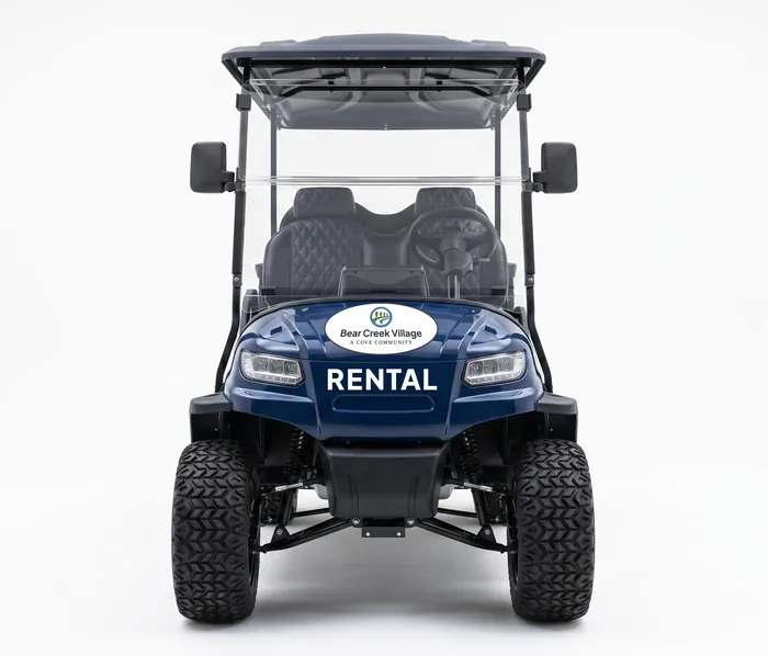
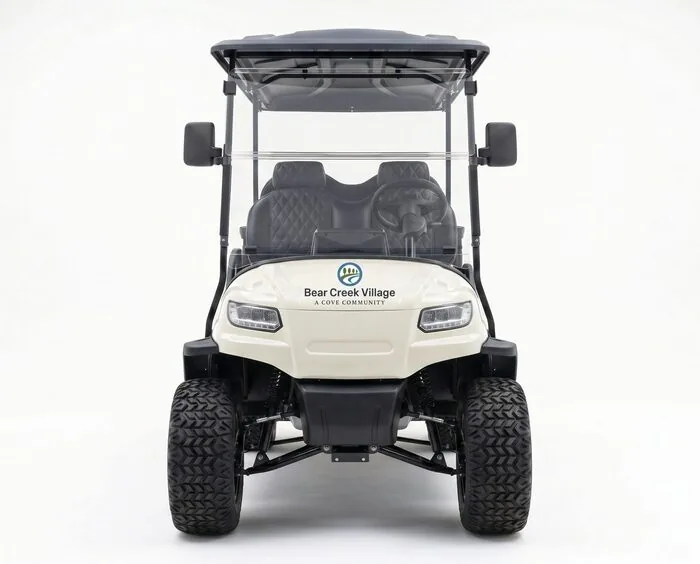
A wrapped cart circulates a property all day, in front of residents and prospects, among the most-seen brand surfaces we have.
Concepts, not final. Cart directions are in development and trucks haven’t started. The system rules below are the durable part; individual vehicles get added to the library as they’re built.
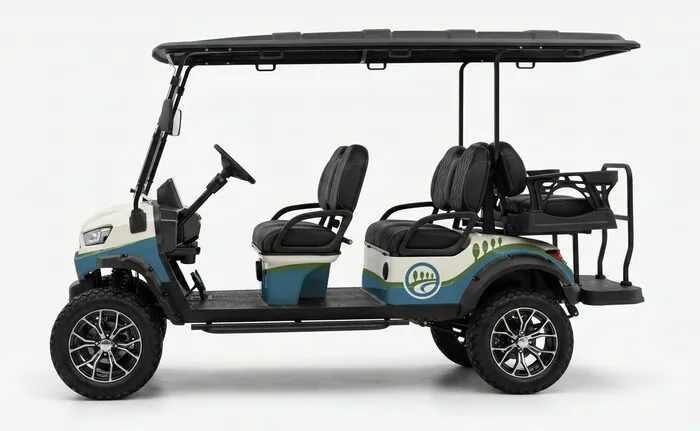
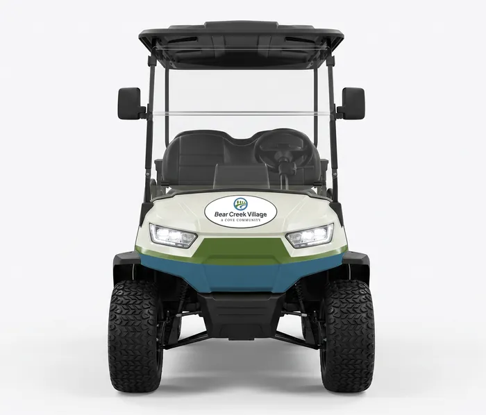
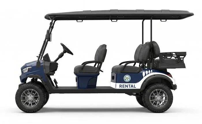

System Rules, These Hold for Any Vehicle, Now or Later
- Treatment level, full wrap or decal (partial). Driven by vehicle role and budget.
- Use category, RENTAL vs TEAM. Guest and staff vehicles should be tellable apart at a glance.
- Chassis colors in the renders: cream, navy, charcoal, green. Approved set still to be decided.
- Vendor files, CMYK vector from the
[PRINT]collections, never a raster.centeredis likely the right lockup layout, as with signage. - Property lockups, each property has its own; show placement rather than only the master brand.
- Don’ts, distorting artwork around curves; running the logo across panel gaps or door seams.
The Vehicle Library, Populate as We Go
| Vehicle | Status |
|---|---|
| 6-seat golf cart | Concepts in progress |
| 4-seat golf cart | Concepts in progress |
| Utility cart | Concepts in progress |
| Trucks | Not started |
Video & Motion Placeholder Specs Only
What Cove footage looks like, and how graphics move over it. Two halves of one workflow: the picture first, then the motion. A first draft of the rules, not yet approved.
Draft, with best guesses marked. The timing and easing come from the CreekFire fall 2026 social spots, the first Cove video built with the card system in code. The footage rules and the rest are a proposal to be tested on the next campaign. Anything campaign-specific (that spot’s display face, its exact shadow and scrim values, its transitions) stays in that campaign’s brief, not here.
The Footage
Video is Photography in motion. Everything the Photography section asks for holds here: real residents and staff, outdoors and water, natural light, relaxed and unposed moments, space and landscape. These rules add what only moving pictures need.
Camera Best Guess
- Steady and slow. Pushes, drifts, and gentle tilts. Handheld is fine when it is calm. No whip pans, no crash zooms, no shaky-cam for energy.
- Eye level, mostly. Drone and aerial shots earn their place by showing something a person on the ground cannot see, such as the water or the layout of a community. Not as an opener by habit.
- Let it happen. Hold on a moment rather than cutting away from it. A resident laughing for three seconds beats three one-second shots.
- Shoot for the crops. Anything load-bearing sits in the center of frame so it survives 9:16 (see Ratios and Safe Areas below). Vertically composed beats get a second, wider take for 16:9.
Grade Best Guess
Warm and true to life, consistent across a spot. Skin looks like skin, water looks like water, and the greens stay natural. No film looks, no heavy vignettes, no teal-and-orange, nothing that reads as a filter. The same rule as photos: if a viewer would notice the treatment before the subject, it is too much.
Pacing Best Guess
| Format | Shot length | Notes |
|---|---|---|
| Social spot, 15 s | 1.5 to 2.5 s | About eight shots. The first shot is the hook, so it is the strongest picture, not the establishing shot. |
| Social spot, 30 s | 2 to 3 s | Room for one held moment near the middle. |
| Property tour or long form | 3 to 6 s | Let shots breathe. Cut on movement, not on the beat, unless the piece is music-led. |
Real, Enhanced, Generated, and Stock
The everyday rule stands: staff do not make AI images or video. What follows is for Marketing-produced work, where the tools are used with care and the results are checked.
- Showing the property: real footage or real photos, always. No AI-generated wide or establishing shots of a community, and nothing that could be taken as a view of a real place that does not look that way. If a prospect could recognize it as somewhere, it is real.
- Enhancing a real shot is fine. Start from an actual photo or clip of the location and use AI to change the season, adjust the light, or change the people in it. The place itself stays as it is.
- Generated footage stands in for stock, not for the property. When a mood, an activity, or a moment is needed and no real clip exists, a generated shot may fill the gap, on the condition that it is clearly not the property: no signage, no recognizable buildings, no landmark that belongs to a real community. Anything a viewer might recognize stays real or photo-derived.
- Stock is welcome when real assets are not available and the piece needs it to carry the message, the emotion, or the event. Prefer generated footage over stock when the stock library does not have the right shot, and prefer real footage over both whenever it exists.
- Every piece is honest about place. A viewer should never come away believing a property has a feature, a view, or a building it does not have.
The Graphics
Everything from here down is about what moves over the footage: cards, type, the logo, and transitions.
Four Principles
- Settle, don’t bounce. Elements ease into place and stop. No springs, no overshoot, no pops.
- Leave faster than you arrived. Entrances are unhurried, exits are brisk. A graphic that lingers reads as sloppy.
- The footage carries the energy. Graphics are quiet. If the shot is still, the graphic can move a little; if the shot moves, the graphic holds.
- Readable first time, every time. Most social video plays muted and is watched once. Every card has to be read in a glance.
Easing
| Use | Curve | Notes |
|---|---|---|
| Entrances | cubic-bezier(0.25, 1, 0.5, 1) | Ease-out. Fast start, long settle. |
| Exits | cubic-bezier(0.5, 0, 0.75, 0) | Ease-in. Gathers speed and is gone. |
| Web, this guide | cubic-bezier(0.22, 0.61, 0.21, 1) | One easing for every reveal on this site. Off entirely when the visitor prefers reduced motion. |
Two curves cover video. A headline landing on a musical beat may use a sharper ease-out; nothing uses a bounce.
Timing
| Move | Duration | Notes |
|---|---|---|
| Entrance | 0.6 to 0.7 s | Fade up while rising a short distance into place, about 2% of frame height. Elements within a card stagger in, a few frames apart. |
| Exit | About half the entrance | Fade out while lifting slightly. The whole card leaves together. |
| Hold | Reading time, see below | A barely visible upward drift across the hold keeps a card from looking pasted onto moving footage. |
| Small moves | 0.2 to 0.3 s | Underlines, rules, counters, anything decorative. |
| Cuts and transitions | Never inside one | A graphic does not enter or exit during a picture cut or transition. Place every card to clear the cut on either side. |
Reading Time and Pacing Best Guess
- Hold a card for one second plus a third of a second per word. Five words holds about 2.7 s. Never shorter than 1.5 s.
- Six words per card, at most. More than that is two cards.
- A 15-second spot carries three to five cards, including the end card. First graphic on screen within two seconds, because feeds decide in that window.
- The end card holds at least 3 s, logo, property or campaign name, and one line of what to do. Built once per ratio and reused across a campaign.
- Words on screen match the voice. Anything in the voiceover that matters is also written, since the sound is usually off.
Type in Motion
- Faces. Plus Jakarta Sans for cards, lower thirds, and end cards. A campaign brief may name a display face for its headlines; that face belongs to the campaign, not the brand.
- Size. Body-sized type does not exist in video. The smallest text on screen is at least 3% of frame height, and about 4% in 9:16, where the phone is held at arm’s length.
- Contrast over footage. Give type a soft shadow or a dark gradient scrim from the edge of frame, whichever the shot needs. Never a hard outline. A solid plate in a brand color is fine when the line is a call to action.
- Reveals. Fade and rise is the default. Type may wipe in behind a mask; letter-by-letter and typewriter effects are out.
- Case and tracking follow the Typography section. Motion does not get its own type rules.
The Logo in Motion
- The logo arrives with the same fade and rise as everything else, or through its own reveal once one is approved (see open items). It never spins, flips, bounces, stretches, or turns 3D.
- Once on screen it holds still. Drift is fine; movement is not.
- Minimum size on screen follows the Logo section, measured against the frame the viewer sees, not the master.
- Clear space applies in motion, including during the reveal.
Transitions Between Shots
Cuts and short dissolves. A push or slide is acceptable when the edit needs a change of place. No wipes, spins, zooms, flashes, or glitch effects. Speed ramps only when the footage was shot for them.
Ratios and Safe Areas
A ratio is a re-layout, not a rescale. Each frame gets its own type sizes and anchors; only the animation is shared. Master at 4K so a 9:16 crop still downsamples cleanly.
| Ratio | Frame | Keep clear of text |
|---|---|---|
| 16:9 | 1920 × 1080 | 5% margin all round |
| 1:1 | 1080 × 1080 | 5% margin all round |
| 4:5 | 1080 × 1350 | Bottom 15% (platform controls) |
| 9:16 | 1080 × 1920 | Top 10% and bottom 15% (Reels, TikTok, Stories chrome), 6% at the sides |
Anything that must survive every crop, in picture or in graphics, lives in the center 9:16 column of the master, about a third of the width. Picture and graphics stay on separate layers; nothing is baked into the master.
Sound Best Guess
- Graphics land on the music, not the other way around. Time cards to beats and to the voice, then trim the footage to fit.
- Voice leads, music supports. Music sits well under the voice and comes up only when nobody is speaking.
- No sound effects on graphics. A card arriving does not whoosh.
- Every spot works with the sound off, and every spot that carries speech gets captions.
Accessibility
- On the web, every animation respects the visitor’s reduced-motion setting and the page is complete without it.
- No flashing. Nothing strobes, and no full-frame flash to white.
- Captions are open (burned in) on social, closed where the platform supports them.
Delivery
| Item | Spec |
|---|---|
| Master | 3840 × 2160, then per-ratio exports at 1080 wide or high |
| Frame rate | Whatever the footage is. The timeline runs at the rate of the dominant source footage and everything else conforms to it, because converting 24 to 30 or back drops or blends frames and shows as judder. Graphics are specified in seconds, so they render cleanly at any rate. When shooting or generating new footage, shoot at the rate you will deliver. |
| Video | H.264 MP4, 8 to 12 Mbps at 1080p |
| Audio | AAC stereo, 128 to 192 kbps, about -14 LUFS |
Open Items
- An official logo reveal. This guide’s Welcome page draws the mark in (swoosh, hills, trees). Whether that becomes the animated logo, and gets built for video.
- Templates. A lower third and an end card per property, with the property logo in place of the master brand, and a home for the card code so the next campaign starts from it rather than from the CreekFire folder.
- Music direction, which belongs with Brand Voice once that work reaches audio.
- Who approves motion.
Brand in Practice
The rules above, actually applied. If you’re not sure whether something feels like Cove, compare it to these.
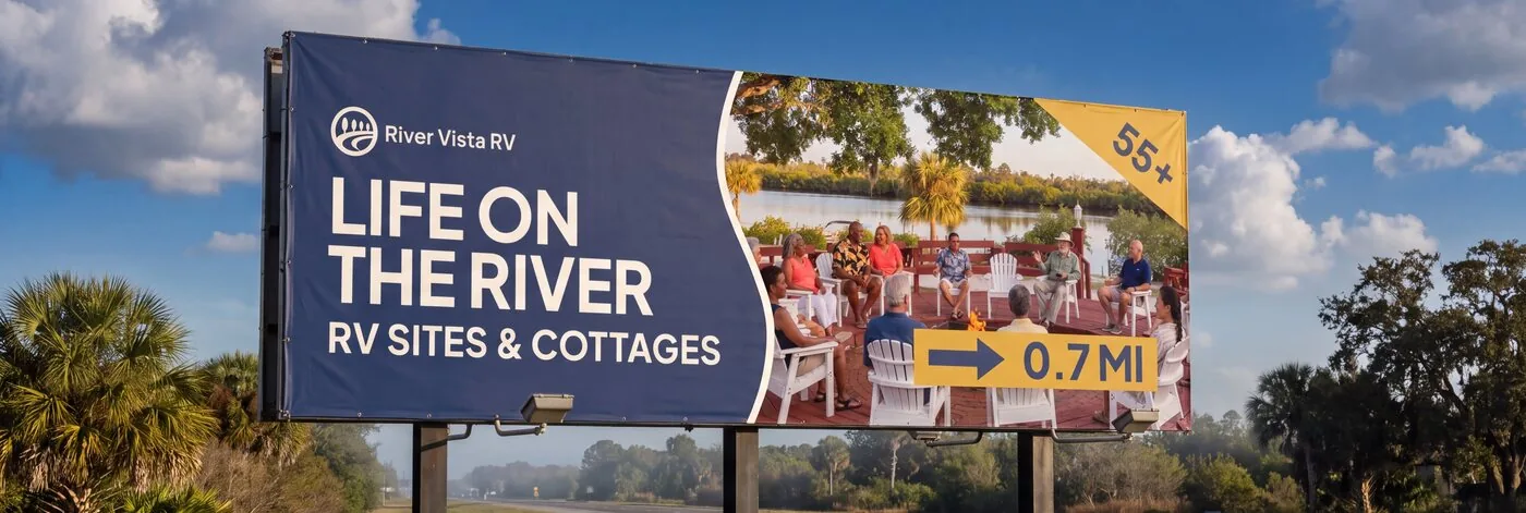
Navy background, white logo, one photograph carrying the message
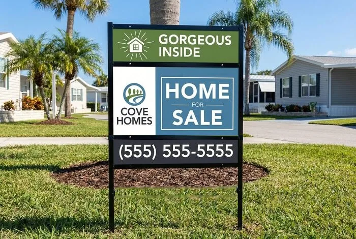
Framed panel with riders, in place outside a listing
Full wrap · cream body · the property’s own logo
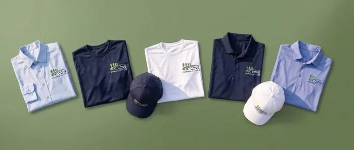
Shirts, polos, and caps · embroidered mark on navy, white, and blues
Email Signatures
Every Cove email signature comes from one generator, so they all match. Pick your community, fill in your details, and copy the finished signature straight into Outlook, Apple Mail, or Gmail. Everything except your name is optional, and blank fields are simply left out. It takes about a minute, and there is nothing to design.

Signs in with your Cove account, so it is staff only. Vendors and partners don’t need it. When you paste, choose Keep Source Formatting, or the logo and colors get stripped out. Trouble signing in or pasting? IT is glad to help at help@covecommunities.com.
Video Meeting Backgrounds
Branded backgrounds for Teams, Zoom, and Google Meet, in eight styles for every community and for the home office. They put a clean, on-brand room behind you instead of your actual kitchen.
- Size
1920 × 1080 - Styles
8 per community - Coverage
all 25 + home office
Opens your property's folder on SharePoint. Signs in with your Cove account, so it is staff only. Download the style you like, then set it as your background in Teams, Zoom, or Google Meet. Without a pick, the button opens the parent folder with every property.
Trouble getting in, or getting it set up in Teams? IT is glad to help at help@covecommunities.com.
Stationery
Letterhead, envelopes, business cards, and name badges are being redesigned as one set rather than four pieces that happen to share a logo. The direction we are settling on is the edge strip: the logo at the top left, a rule under it, and a band of brand color along the bottom carrying the website. On a business card that band turns and runs up the side.
It stays quiet, it holds together across all 25 properties, and every piece is drawn to take the longest name, title, and address we actually have rather than only the short ones.
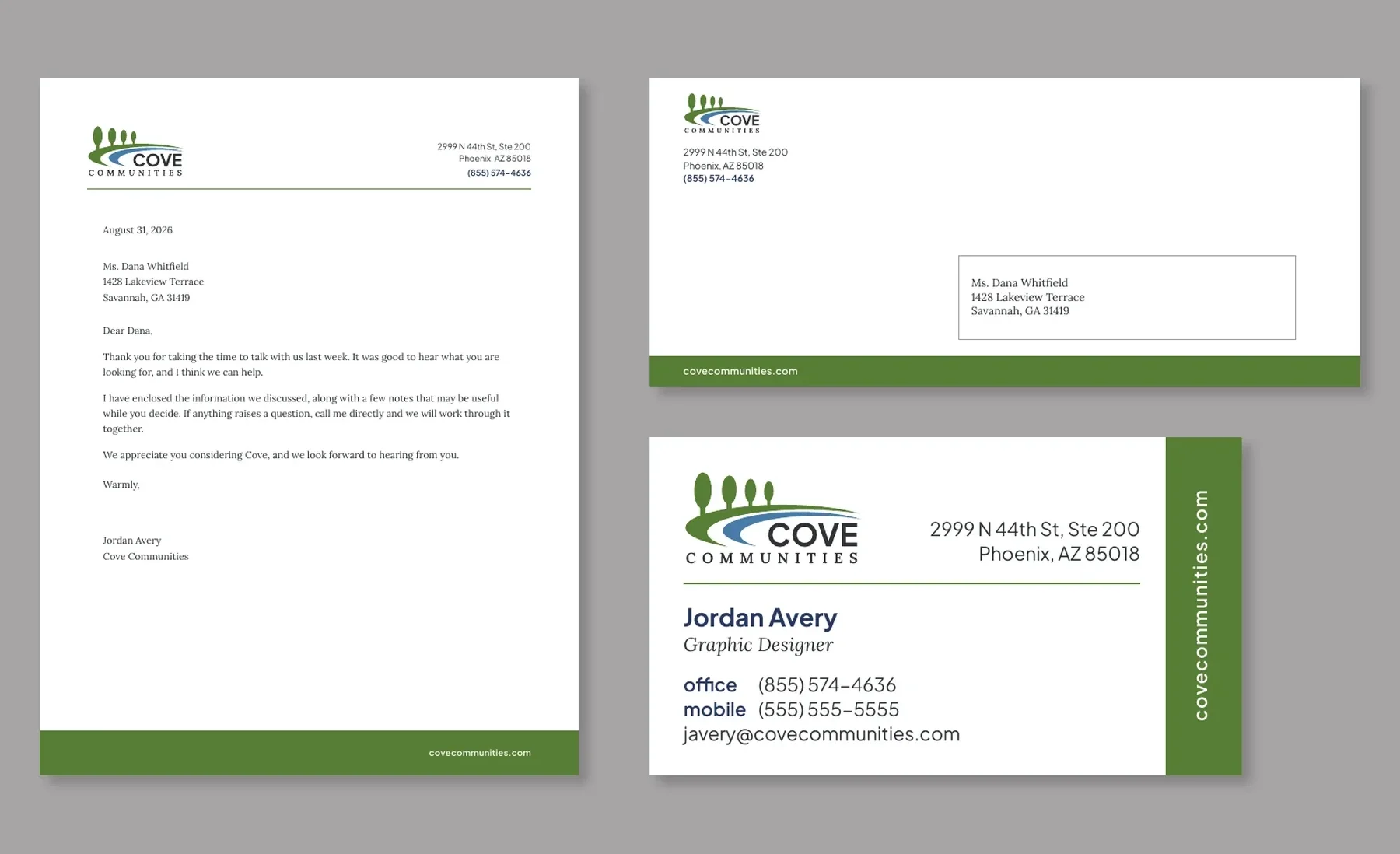 Concept, not approved
A sage band along the bottom edge, turning to run up the side of the card
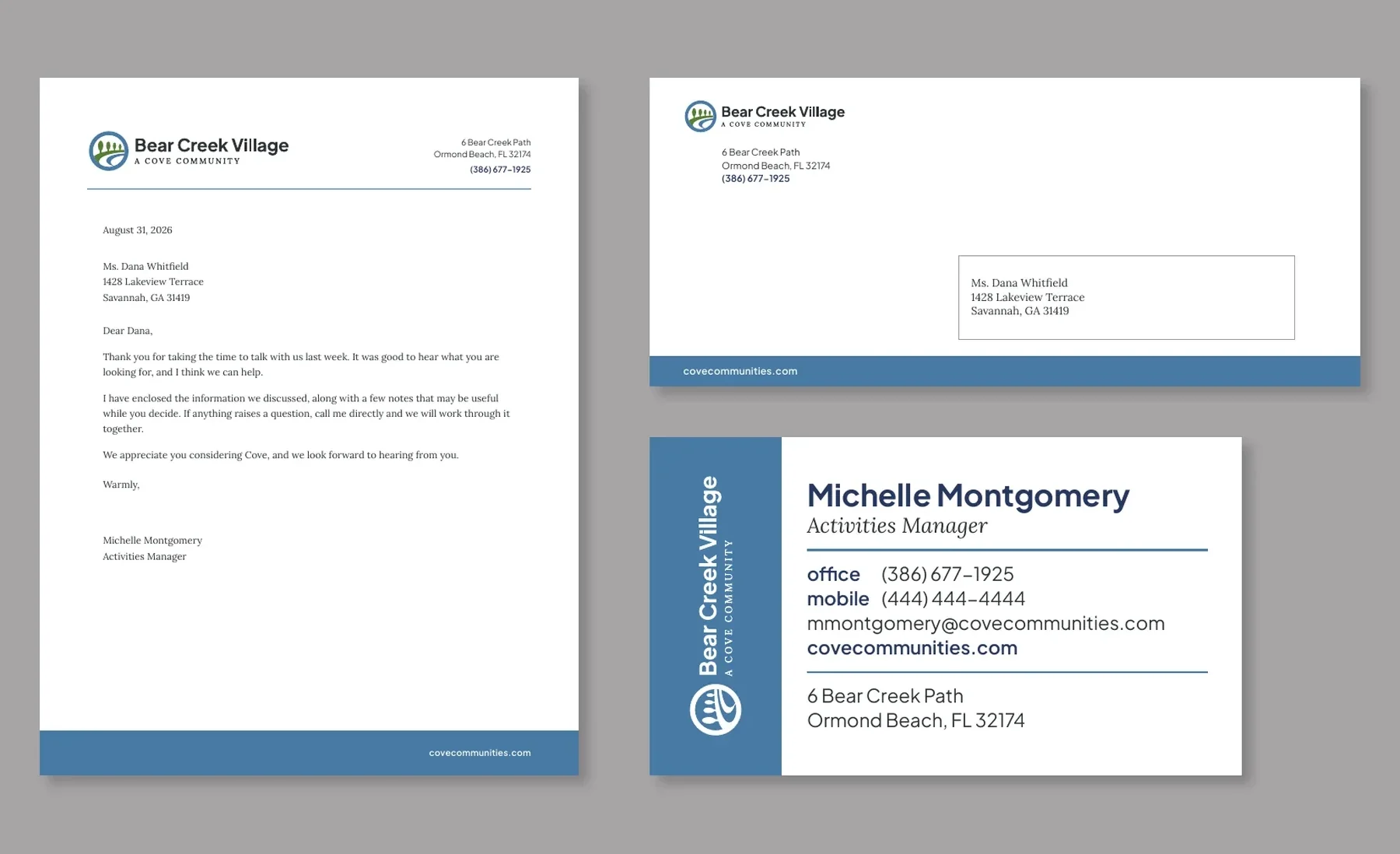 Concept, not approved
The same build carrying the property logo and its own color, which is what makes it hold together across all 25
Nothing to order yet. These are concepts under review. Keep using the current templates on the ordering site until the new set is approved and loaded.
Interiors & Exteriors
As clubhouses and amenity spaces are renovated or newly built, they are moving toward a shared look: light siding under a gray metal roof, black fixtures and hardware, exposed beams, board and batten, and green-blue tile set against warm neutrals. The four below are concept renderings rather than photographs of any Cove property, and the direction has not been formally adopted yet. They are here to show where things are heading, not to set a standard.
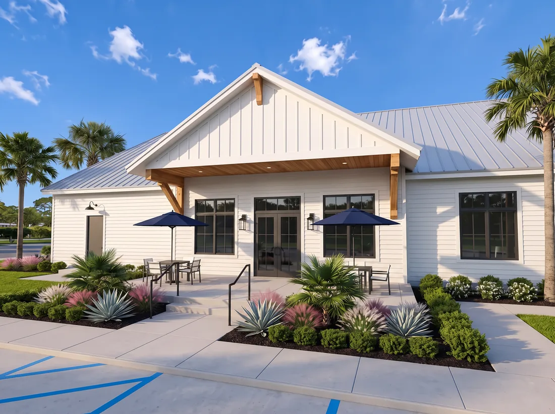 Concept rendering
Light siding, a gray standing seam roof, wood beam brackets, and black gooseneck lighting
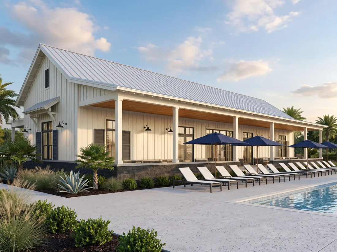 Concept rendering
The same materials outdoors, with navy carrying the brand color into the furniture
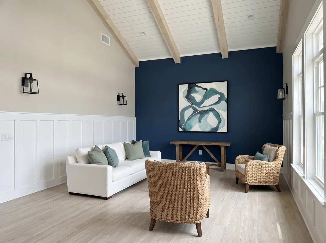 Concept rendering
Warm neutrals and white paneling, with a single deep navy wall doing the color work
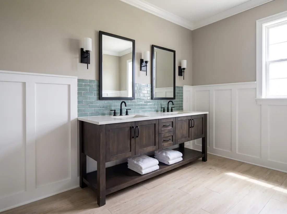 Concept rendering
Green-blue tile, black hardware, and wood-look floor, the finishes in one frame
Nothing here is a request to change anything at your community. This is a gradual shift that happens at renovation and new-build moments over a period of years, never as a retrofit. If your clubhouse looks nothing like these, that is expected, and there is nothing to do about it today.
Interior and exterior design decisions are made with the CapEx and Construction teams, alongside the standards they are developing. That includes an interior paint standard, which already exists and sits with those standards, which is why there are no paint colors on this page. The Cove Communities Catalog, still in development, will be where you find exactly which paints, finishes, and furniture to order.
Real pieces, all Letter size, shown as full pages. Notice that each one leads with a single message before it gets into the detail.
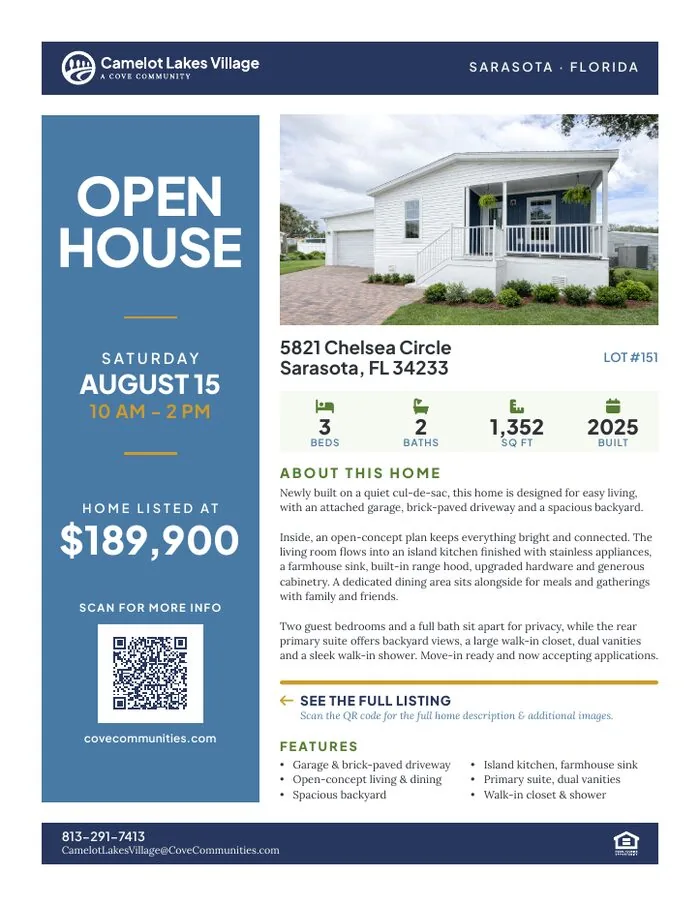
Camelot Lakes Village · one home, with the price and date set large
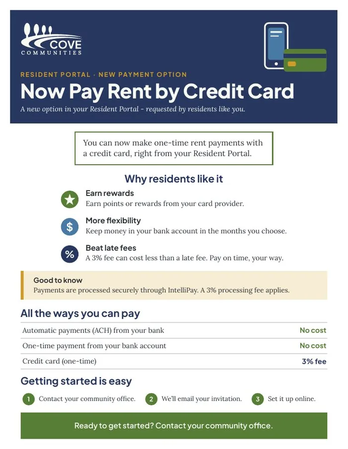
A billing change in plain language, with the fee stated up front
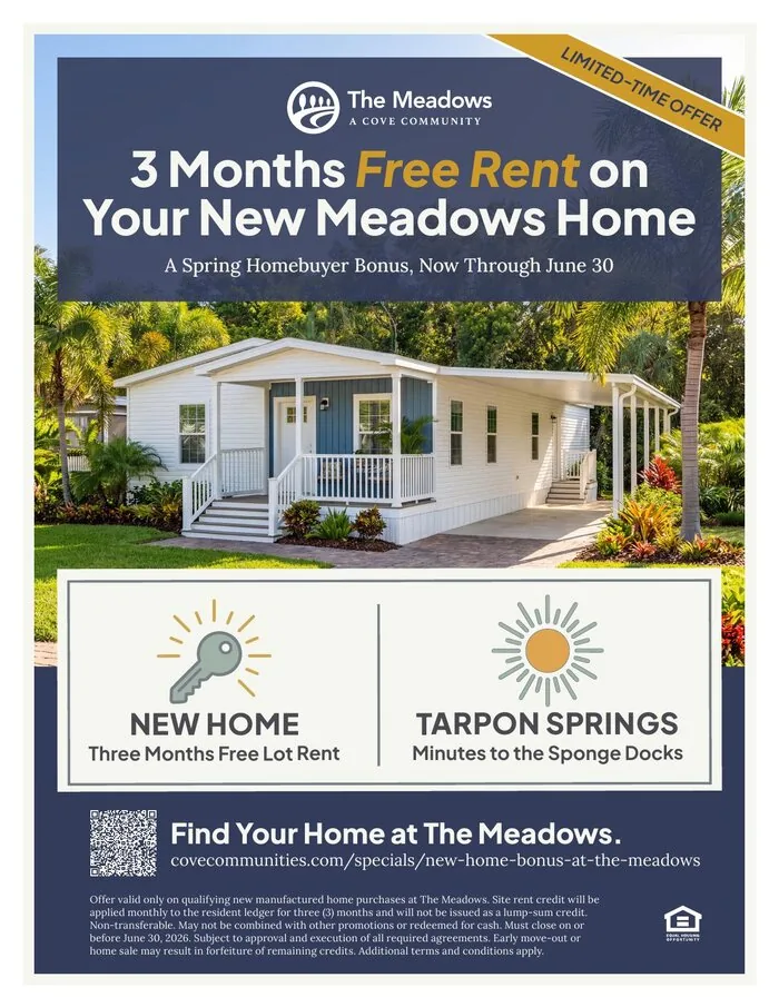
The Meadows · one offer, one deadline, and the conditions set out in full at the foot
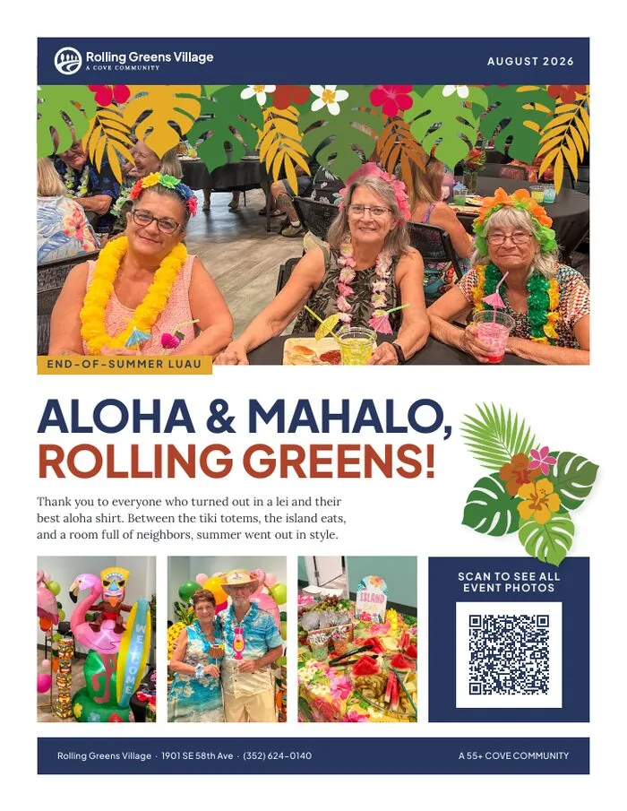
Rolling Greens Village · residents fill the page before any copy starts
Digital Ads
A campaign does not run as a single ad. It runs as a set: the same message rebuilt for every shape a website might have room for, from a tall column beside an article to a thin strip across the top of a page. Below are two complete sets, running here exactly as they ran.
Rolling Greens Village
Move-in ready homes in Ocala. The wording and the price stay put while the photography changes behind them, so the offer reads whenever someone happens to glance at it.
Jamaica Bay Village
The same idea in sage rather than navy, which is a useful demonstration that the palette works either way round.
Every unit is shown at the size it actually runs, so the type you see here is the type a reader sees. Only the widest shape in each set is nudged down slightly, because it is a little wider than this page. Notice that the message survives every shape: the tall units and the thin strips are not crops of the big one, they are laid out again so nothing important gets squeezed out.
Downloads
Almost everything lives in Bynder, our library. The logo folders need no login.
Logos, No Login Needed
Digital = Word, PowerPoint, email, web, social. Print = anything going to a printer or sign vendor.
Fonts
Both are free and open-source, install them on any machine, and share them with vendors.
Video Meeting Backgrounds
One folder per property plus the home office, eight styles each. To jump straight to yours, use the property picker under Brand in Practice.
Photography & Everything Else
The full library needs a Bynder account. Seats are limited, request one via the Marketing Request Form.
Coming soon, templates
A library of ready-made flyers, social posts, signs, and slide decks, so you can start from something rather than a blank page. This will become the most useful link on this page.
Source Files
Approved logo artwork, every property, layout, colorway, and format, lives at 2026-06-15 COVE new logo packages/out. That folder is the source of truth; when a summary document and the artwork disagree, the artwork wins.
Also available: color swatch files (.ase / .clr), the logo inventory spreadsheet, and the deliverables spec.
Still to Produce
InDesign templates with paragraph, character, and object styles plus a loaded swatch library · Word and PowerPoint templates with theme colors baked in · a Canva brand kit · email and social templates. These are the enforcement layer, guidelines describe, templates enforce.
Using AI
AI tools can help you get started. They cannot speak for Cove, and they cannot draw it. This is the current policy; a more comprehensive one is in development.
- Use AI for writing inspiration, not finished copy. It’s fine to ask for ideas, headline options, or a starting point when you’re stuck on a blank page. Don’t copy and paste what it gives you straight into a post or newsletter. Readers can usually tell, and we want to sound like real people. Rewrite it in your own words and read it out loud before it goes out. If it doesn’t sound like something you’d say to a resident standing in front of you, it isn’t ready.
- AI is not okay for images or layouts. No AI-generated photos, and no AI-generated flyers, posters, covers, or social graphics. The tools can’t get our logo right, they invent buildings and amenities we don’t have, and they produce people and places that aren’t real. Anything with our logo on it needs to come from a real design file.
- Use real photos of your community. A phone photo of the actual event, the actual clubhouse, or actual residents will always beat anything AI makes up. If you need something you don’t have a photo of, ask.
- If you’re not sure, ask before you post. That’s a lot faster than taking something down after it’s already out there.
And never the logo. AI tools cannot reproduce the Cove mark correctly; there is a real example of what they produce in Logo Misuse. Anything carrying our logo comes from a real design file, downloaded from Bynder.
The guidance above is the brand side of it. Cove also has a formal company AI policy, maintained by IT, covering confidential information, accuracy, intellectual property, and which tools are permitted. It sits with the rest of the computer and technology policies.
Signs in with your Cove account, so this one is staff only. Where the two overlap, the company policy wins.
Using the Brand
When in doubt, ask. We’d much rather help early than fix it after it’s printed.
Who to Ask
For anything brand-related, from a file you can’t find to a vendor asking for something unusual, the fastest route is the Marketing Request Form. It goes straight into our project system, gets auto-assigned to the right person, and nothing falls through the cracks. It covers design requests, Bynder access, email sends, reprints, social help, and more.
When to Check with Us First
- Anything going to an outside printer, sign shop, or wrap vendor
- Anything with a budget behind it, paid ads, large print runs, permanent signage
- Anything using colors or layouts outside the approved combinations
- Anything a resident or prospect will see that isn’t built from a template
Day-to-day flyers, notices, and social posts built from templates will not need review once the templates are out; that is what the templates are for. Until then, send us anything a resident or prospect will see, and we will turn it around quickly.
Source-Of-Truth Precedence
Established by inspection, and worth stating plainly because this guide is about to become another summary document: artwork > the logo inventory spreadsheet > summary documents. The 2026 source style-guide doc has already been found wrong on property-name case, the RV tagline vocabulary, and the “Vertical” layout name.
Still to Define
- Version number and changelog, without it nobody knows whether their copy is current.
- Named approver per layer, who signs off a new property lockup vs a template vs a color addition.
- Deprecation policy. Three transitions are live right now: old-palette logos still circulating, already-wrapped vehicles, and legacy single-rider sign frames. A system states sunset rules once instead of answering ad hoc forever.
- Onboarding path for new staff and vendors, “read these three things first.”
- Audit cadence, even an annual pass to catch drift.
- Motion standard. This guide is the seed: one easing curve (
cubic-bezier(.22,.61,.21,1)), 200 to 500ms, settle-down character, always honoring reduced-motion preferences. Formalize per medium later.